SHARE
React: ThemeProvider Styling Solutions


Contents
Contents
The Need for a Theme
So, there you are, it’s been hours since you started searching the web looking for parts to customize your car, to make it stand out in the street, to make it louder and faster, perhaps you want a better stance or maybe some flashy wheels. What you want is to customize it, to ride in style. Here I’ll show you how to use React.js as a ThemeProvider for styling.
Just like a car, the web has different parts (or, as we call them, components) that I have to modify so it stands out from the rest.
The choices you make, the parts you select, and the approach you take to customize a car are, believe it or not, similar to the ones you make for an app. Bad choices and the car will end up worse than its stock form, so choose your customization approach carefully. For the car, you will need patience, research, and money (tons of it). For the app, however, you can try theming with a ThemeProvider from Material UI.

What’s a Theme?
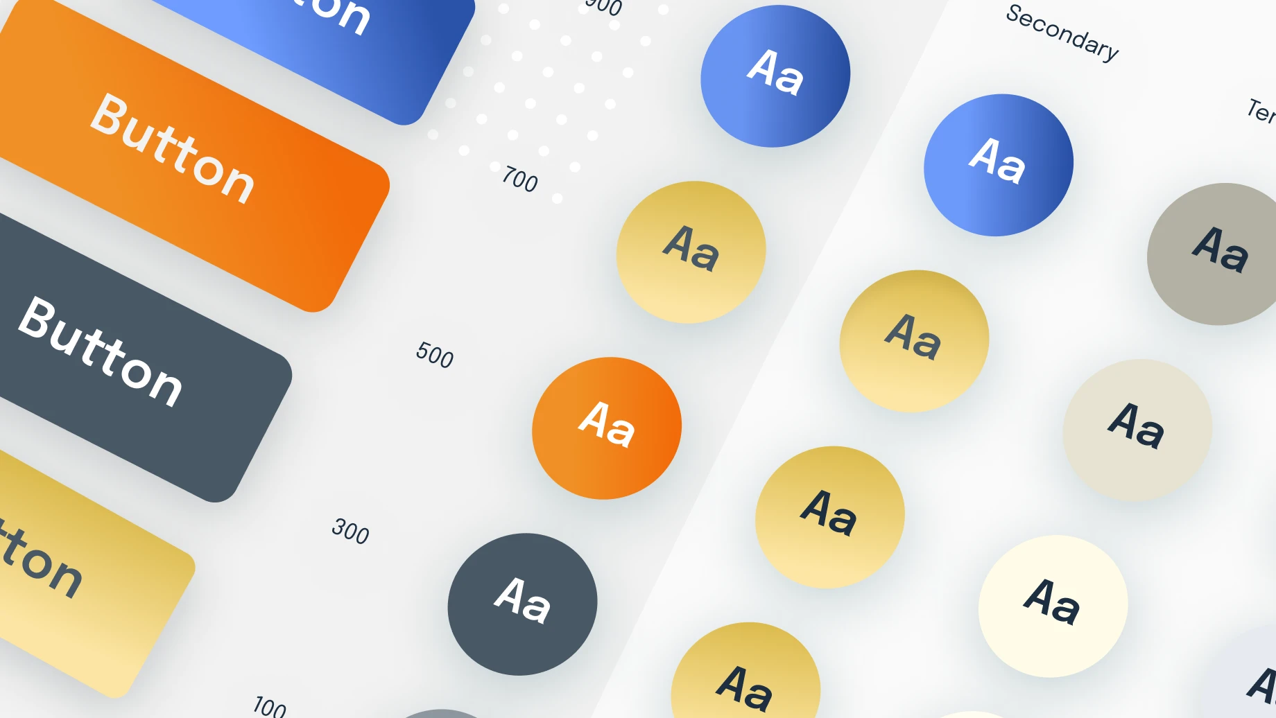
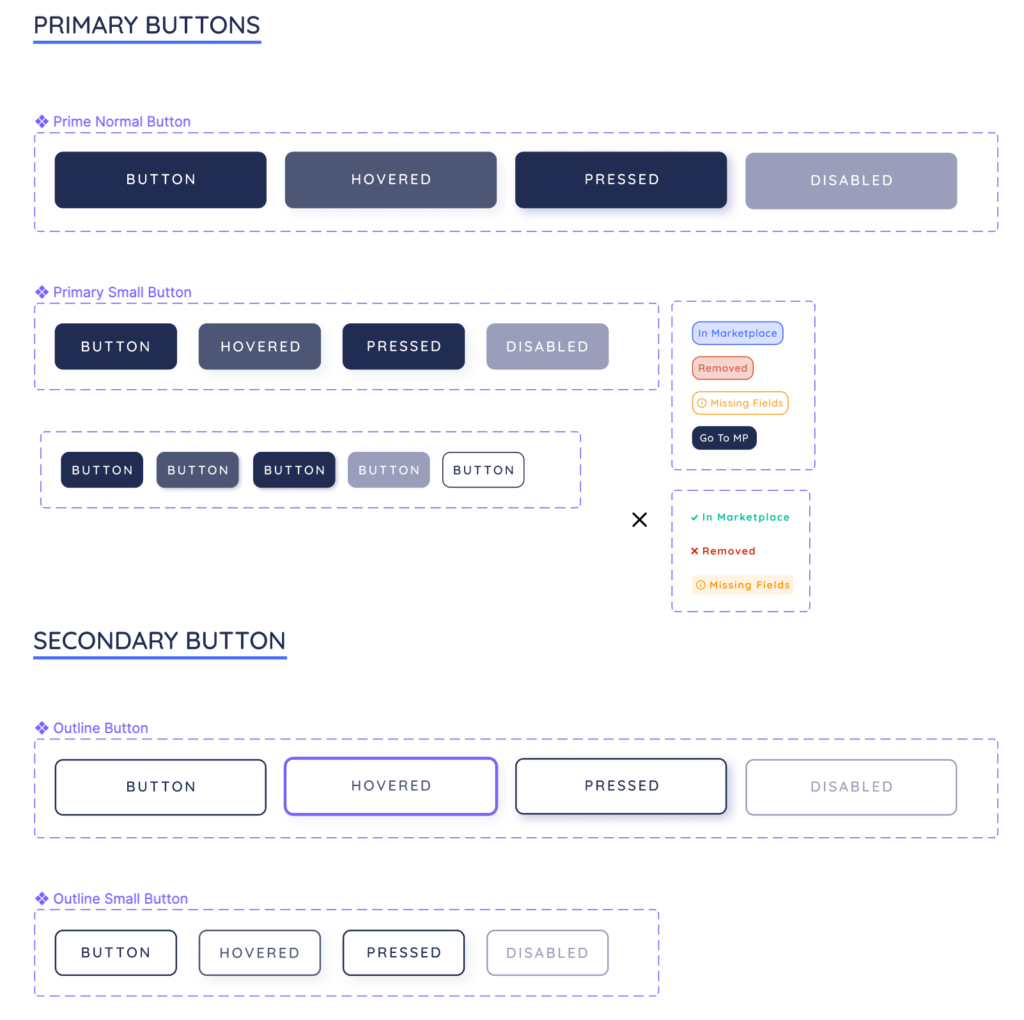
A theme specifies characteristics of components such as colors, fonts, level of shadow, appropriate opacity of link elements, etc. If you are familiar with UI style guides, a theme is essentially a programmed version of a UI style guide.
A theme allows you to customize all design aspects of your app in order to meet your specific needs. – See? like the car.
Think of the most common example, nowadays apps have a dark and light modes to choose from, each of which is its own separate theme with different text and background colors. Different CSS and JavaScript libraries have different ways of applying themes to your application. Here, I will be discussing theming using React Material UI ThemeProvider, but the general idea is the same regarding the library or framework you use.
Using a Material UI ThemeProvider
To customize your theme, you can use a ThemeProvider which is a feature that uses the React context API to pass down the theme to components in the React component tree.
Before you start programming, let’s take a step back. Organizing an MUI theme using the ThemeProvider is very much like building a style guide. I’m fact, style guides will inevitably inform the variables that you set in your theme. Knowing the typography, font sizes, colors, and the different states of the components you will have in your application will help a lot when creating your theme. If you’re working with a UI designer, this might be a good time to pull them in to talk about design systems and style guides. You can always change your theme later, but aligning on some basics ahead of time is nice.
So, once you have that you have a component system or style guide go ahead and write some code. The first thing will be to create a theme file and tell the theme what variables you are customizing within your theme. Material UI ThemeProvider, provides two main types of customization. First, you can customize global CSS properties like your primary and secondary brand colors. These variables will be applied to all MUI components by default. But you can also apply global styles to a specific MUI component. In other words, if I wanted to change all of the MUI tooltips in my application, I could style them within a ThemeProvider that wraps my components. That’s what we will do below. Here is the code to actually create a theme within Material UI:
Next, we wrap our app with the ThemeProvider at the highest level possible so all the components can benefit from it.
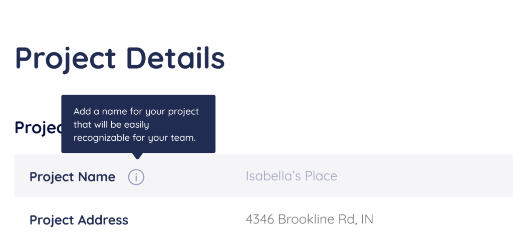
And now to style our MUI tooltip component.
Notice how we are not adding any className prop or using any styled component feature in this code snippet. We are simply implementing the tooltip, but no styling is involved in this file. We are able to do that because Material UI stores your ThemeProvider’s theme in a React context, and then passes it to all child components of that context for styling purposes. This really DRYs up your CSS.
What’s the idea here? It’s to simplify and minimize the amount of code we need to write to style a component and to centralize the styling of our application and our React components so that we can easily make updates that propagate through all component instances. What we want is to improve the consistency of styles applied to the app.
Let us look at what this bunch of code looks like in the browser:
Riding in Style with React ThemeProvider
The Material UI tooltip component will now look the same across the entire application. If we want to change its background because we are now in Dark Mode or because our designers decided to update our color scheme, we could simply change the theme without any other modifications to the component. As far as our application code is concerned, our tooltips don’t seem to know about the theme or any CSS properties that we are trying to apply to it. This is because the React Material UI library does that under the hood and provides us with sensible defaults that we can customize on a global level.
Here are 5 Tips to Speed Your React Components Development Up
Less code, cleaner code, more style!
Work with a React.js Development Company.
Expert React Development Services
Flatirons provides top-rated React development services.
Get the CEO's Take
Handpicked tech insights and trends from our CEO.
Expert React Development Services
Flatirons provides top-rated React development services.
Get the CEO's Take
Handpicked tech insights and trends from our CEO.


Perl vs Python: Choosing the Right Scripting Language
Flatirons
Apr 20, 2025

IoT Database: Manage Connected Device Data Efficiently
Flatirons
Apr 14, 2025

Proof of Concept Template: A Step-by-Step Guide
Flatirons
Mar 26, 2025

Objective C vs Swift: Which is Better for iOS App Development?
Flatirons
Mar 25, 2025

Scala vs Kotlin: Comparing the Functional Programming Giants
Flatirons
Mar 22, 2025

IoT Smart City Solutions: Transforming Urban Living
Flatirons
Mar 17, 2025
