SHARE
5 Tips to Speed Your React Components Development Up


Contents
Contents
Having spent a few years advising tech teams on how to speed up their front-end development, I’ve seen nearly every mistake in the book. I’ve also seen and implemented a great deal that works. Based on this experience, I’m going to share with you 5 tips to speed your React Components development up to five times faster quickly and simply.
Each of these React Components development tips has been implemented and pre-configured for you in this repo.
Introduction
Front-end projects are becoming more and more complex, and with each passing day, more logic is added to this layer of the application.
With this growing demand, it becomes increasingly difficult to simulate complex use cases, as well as ensure that all variations of the screens, buttons, labels, alerts, and everything in between are working correctly.
Apart from this increasing complexity, it is necessary to reuse each of these code pieces, so you don’t have to recreate them on another screen.
For that, our first secret weapon is: CDD – Component Driven Development.
Tip 1: Component-Driven Development
CDD is a project organization methodology focused on creating the smallest self-sufficient fraction of code possible, making it possible to create multiple pieces of the project at the same time.
“Components are standardized, interchangeable building blocks of UIs. They encapsulate the appearance and function of UI pieces. Think LEGO bricks. LEGOs can be used to build everything from castles to spaceships; components can be taken apart and used to create new features.” – Tom Coleman.
Doing a project with this kind of mindset has multiple benefits, notably accelerating delivery, as there is no coupling between components. In general terms, you use 4 steps to create your components in an uncoupled way, following the definition of the CDD website:
- Build one component at a time: Build each component in isolation and define its relevant states. Start small. Examples: Avatar, Button, Input, Tooltip
- Combine components: Compose small components together to unlock new features while gradually increasing complexity. Examples: Form, Header, List, Table
- Assembly pages: Build pages by combining composite components. Use mock data to simulate pages in hard-to-reach states and edge cases. Examples: Home page, Settings page, Profile page
- Integrate pages into your project: Add pages to your app by connecting data and hooking up business logic. This is when your UI meets your backend APIs and services. Examples: Web app, Marketing site, Docs site
In other words, it is more a way of thinking and organizing, but it is also a practice of coding. To illustrate these concepts, we will use Storybook.js to create a basic practical application.
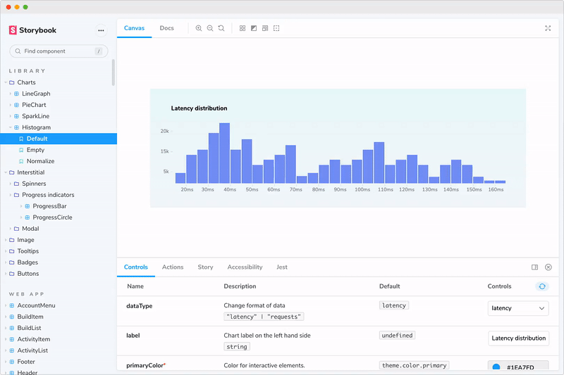
Tip 2: Storybook
Storybook is an open-source tool designed for UI components that allows you to visualize, test, and verify every variance of your components.
It is extremely useful because it allows you to develop components without needing any project configuration with CRA or Vite (check the example). It also has a hot reload feature which works great.
Using Storybook is simpler than you might think, but elaborating on how a project is configured from scratch is beyond the scope of this article. If you want to learn more, you can read about it here.
💡 To make it easier, I have created a repository with some examples in React and React Native, feel free to clone and modify it.
One of the biggest benefits of the tool is that you can create multiple versions of the same component, being able to force use cases in order to facilitate usability tests or scenarios that are extremely difficult to simulate in a conventional application.
For example, imagine that you have made a request to the server and until the request finishes, your button should be in an inactive state. In a real-world scenario, the request may take only a few milliseconds, making it almost impossible to validate if the button is in an inactive state.
Let’s look at the example of the button scenario. You should simply create a regular React component:
Next, you have to create a Story file. This file will be responsible for rendering your component and the variations we wish to deploy. To create those variations, just call your component with the properties of the state you want to test:
As you can see from the above, each component should be considered separately, as purely and independently as possible.
Considering your components individually and independently will make it easier to visualize your forms, as well as making it easier to perform unit test cases, since you will rarely have external dependencies.
Now, we have to learn how to organize a large set of components: let’s take some time to learn a bit about atomic design.
Tip 3: Atomic Design
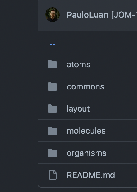
Organizing your application with atomic design is simpler than it sounds. The logical process of atomic design is for you to think of your components as atoms, molecules, organisms, and templates.
Here’s a representation of how to organize your components within this structure:
Atoms: Are usually made with only one single HTML element. (Examples: Atoms, Alert, Badge, Button, Dropdown, ErrorMessage, Fieldset, Heading, Icon, InputLabel, InputRange, InputText, Legend, Link, List, Logo, ScrollableArea, SidekickCard, Spinner, Text, Trustpilot)
Molecules: are a collection of atoms to build customized pieces of UI (Examples: Banner, CheckboxField, CheckboxGroupField, DropdownField, DropdownFiltered, ExpiryModal, Help, LoadingSection, Modal, Notification, NumberText, Progress, RadioField, RadioGroupField, TextField, Tooltip, Footer)
Organisms: are a collection of atoms, molecules, and their own specific sub-components to build large pieces of UI. (Examples: Navbar, Accordion, Form, Card, Tabs.)
Templates: these are a collection of components to build templates for the pages. (Examples: Error page, Product Page, Cart Page, etc…)
In practice, this means you will need to put your components into different folders:
An excellent way to learn more about how to structure your components is by examining current open source libraries. I recommend you start reading code repositories like this one.
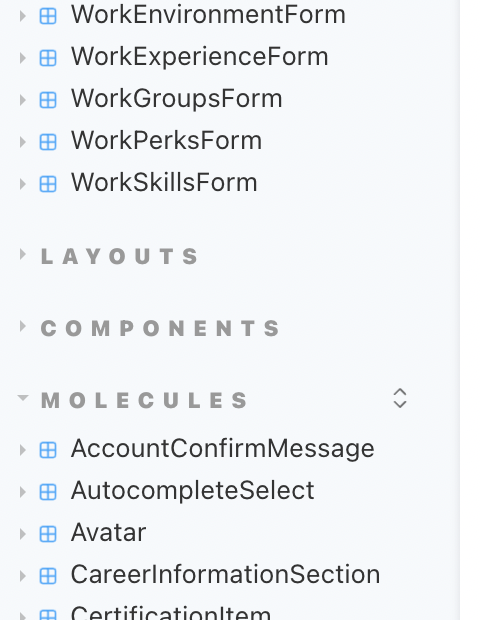
It is also important to pay attention to the storybook labels.
(‘Atoms/<YOUR_COMPONENT_NAME>’)

That way, your components will be organized in the storybook UI similar to this structure.
Why don’t we look next at how to automate the creation of your components, interfaces, unit tests and Storybook files? 👀 Let’s dive in!
Tip 4: Magically generate your components
One way to greatly speed up the creation, organization, and testing of your components is by creating a code generator.
This generator is extremely important because no matter how many programmers there are in your project, the code structure will look like it was written by a single person, following and respecting the same patterns, lint rules, test coverage, and usability tests.
Tests and Storybooks are a great way to document the entire process, and this code generator helps us by minimally forcing your project to not become a total mess in the long run.
Apart from helping to speed up development and maintain code integrity, it also helps to maintain a greater clarity about the organization and size of the files, since in this structure the files are already purposefully separated so they don’t grow huge and are difficult to maintain.
You can check an example of our code generator tool here.
Tip 5: The Power of snippets
Another powerful option for you is the use of custom snippets in order to act as scaffolding for common everyday files, like components, tests, CSS, etc.

To use custom snippets on VSCode is very simple, you just need a folder called ‘.vscode’ on the root folder of your project, then add a file called ‘YOUR_TECH_SNIPPETS.code-snippets’.You can check a working example here.
You just need to create an object with the following keys:
- Body
- Description
- Prefix
More details can be found on their official documentation.
Also, check this useful website, which helps you to create your own custom snippets for a variety of IDE’s.
Bonus: Centralize your tokens in a theme provider
For this secret, only our loyal readers will be rewarded. To learn more about how to centralize tokens in a theme provider, check out this blog article :).
Feel free to apply all of these React Components development tips to your projects and send your feedback to me on Linkedin.
Last but not least, if you want to work with the best front-end tools and methodologies on amazing projects for US customers, join our team!
Happy coding,
Expert React Development Services
Flatirons provides top-rated React development services.
Get the CEO's Take
Handpicked tech insights and trends from our CEO.
Expert React Development Services
Flatirons provides top-rated React development services.
Get the CEO's Take
Handpicked tech insights and trends from our CEO.


Record Information System (RIS) for Healthcare Data Management
Flatirons
Jul 02, 2025

Proof of Concept Examples: Validating Ideas in Action
Flatirons
Jun 30, 2025

Javascript Developer Salary Insights in the US
Flatirons
Jun 28, 2025

Powerful Electron Alternatives for Cross-Platform App Development
Flatirons
Jun 28, 2025

Why Is Python So Popular – Explained for Beginners
Flatirons
Jun 28, 2025

What is a White Label App?
Flatirons
Jun 28, 2025
