Client case study

Simplifying real time customer feedback.
HOSPITALITYSAASB2B
Simplifying real time customer feedback
Simplifying real time customer feedback left
Simplifying real time customer feedback right

The Goal

Tattle is an analytics platform that measures customers’ dining experiences and delivers real-time feedback and data to their hospitality partners.

Tattle partnered with Flatirons to roll out a new product offering called Snapshots, which generates actionable insights from the data collected to help restaurant chain General Managers, District Managers, and Executives focus on improving the areas that matter most to their customers.
What we did for
Tattle.

User Research

User Research

User Experience Design

User Experience Design

User Interface Design

User Interface Design

Custom Design System

Custom Design System

User Research.

To better understand user needs, behaviors, and motivations, Flatirons began by conducting user interviews. We spoke with 10 General Managers, 5 District Managers, and 3-4 C-Level Executives located across the country to identify current pain points and solutions, understand exactly who the users are and how they are likely to interact with the platform, and what they need from the product to be successful. We then repeated this process throughout the duration of the project by continually conducting usability testing to ensure the prototypes we were building were intuitive, user friendly, and effective.

Dashboard Design By User Type.

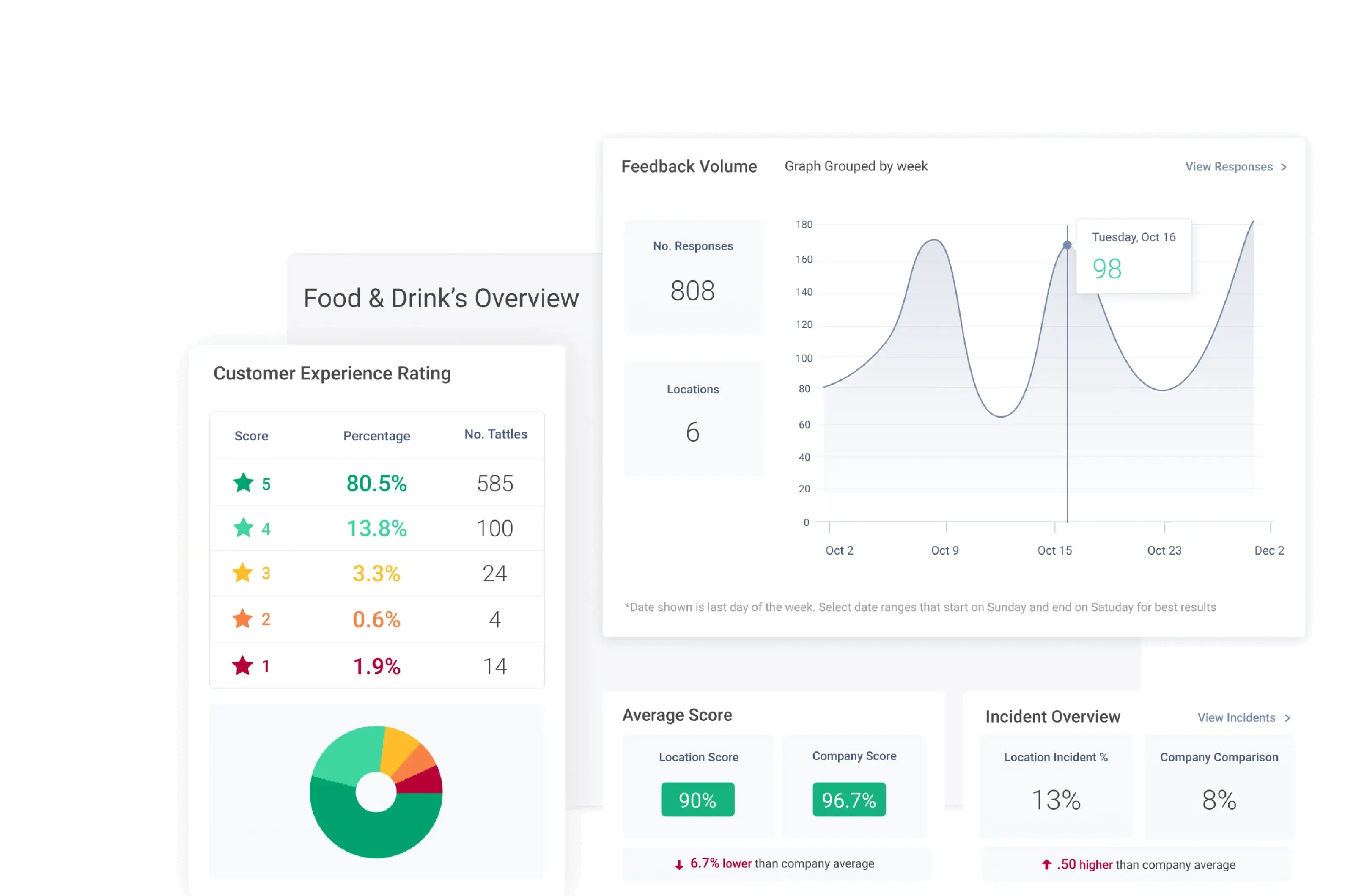
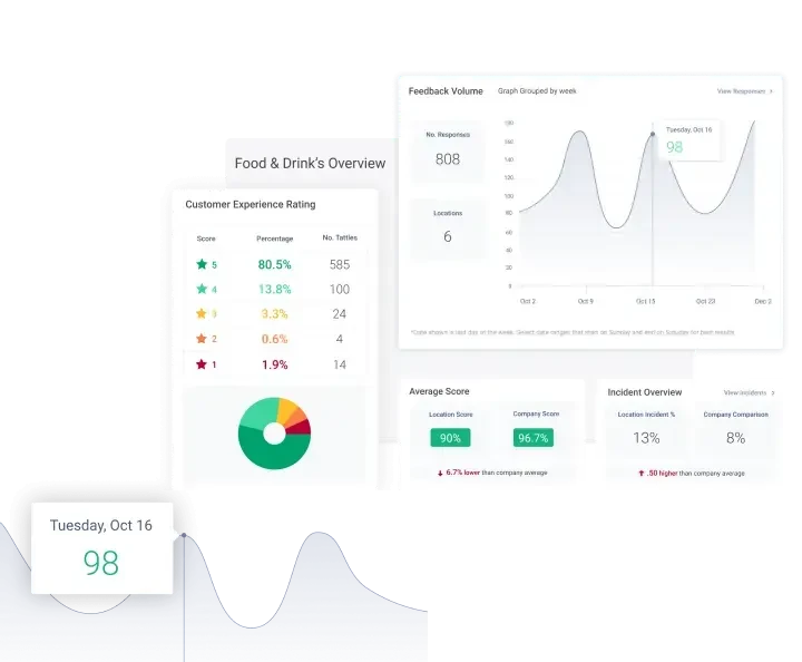
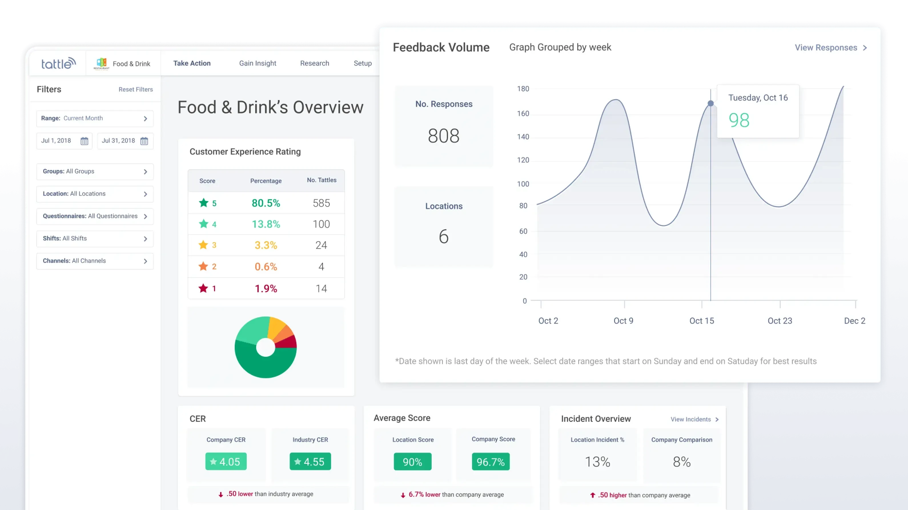
As the first thing a Restaurant Merchant sees after logging in, we designed the Merchant Overview Dashboard to give the user a high-level overview of how the restaurant is performing and quick insights into the areas their customers care about the most.

Merchant Overview Dashboard

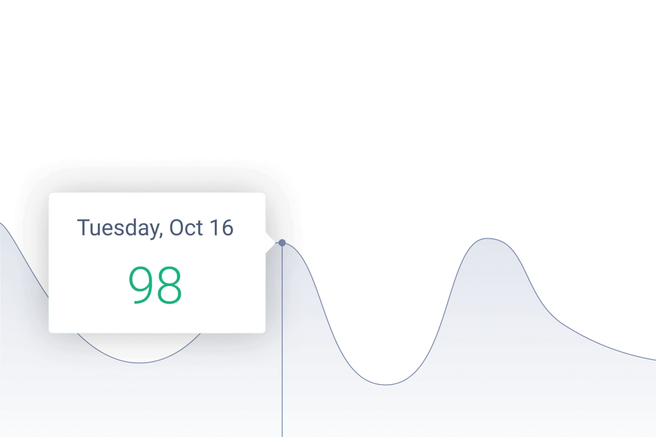
To allow General Managers to quickly identify areas of concern, the GM Dashboard highlights customer feedback and areas for improvement. With easy to interpret friendliness scores, trend graphs, detailed customer reviews, and quick-add action items, GM users can easily understand how their efforts are impacting the customer experience over time.

Restaurant Dashboard

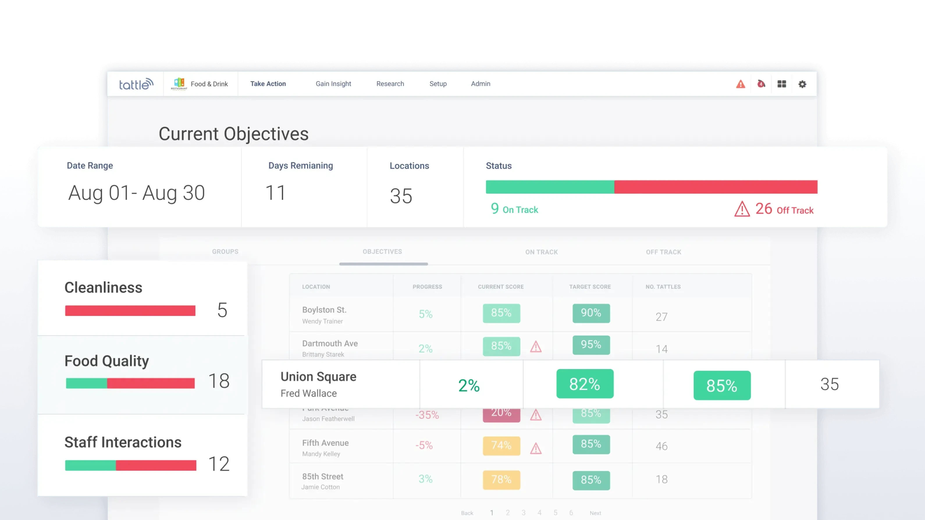
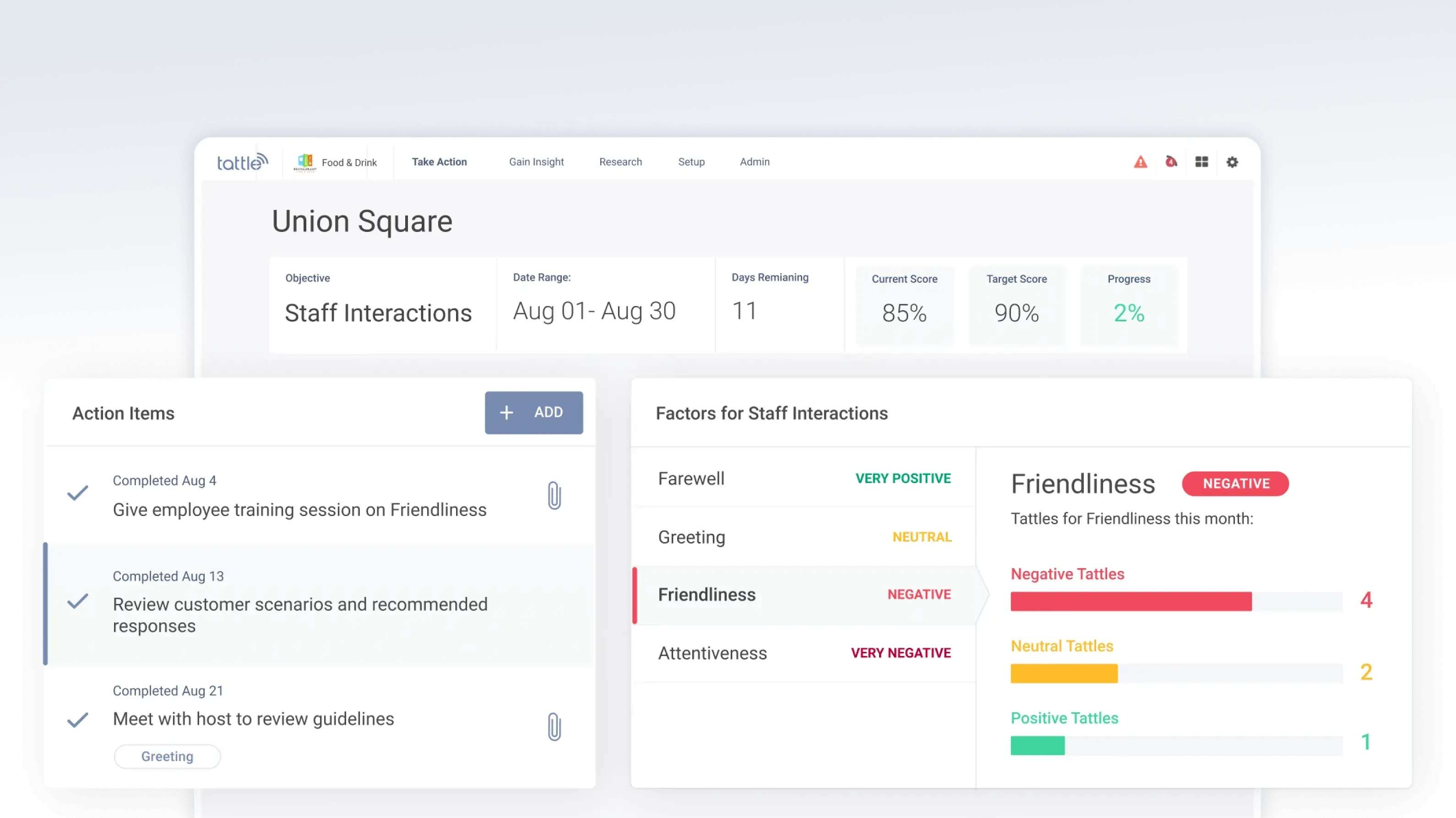
After speaking with restaurant Executives and District Managers, it was clear they need their own dashboard so they can view the progress of their locations at a higher level. The user interface is designed so these users can quickly understand which restaurant locations are on track to meeting established goals and which ones are trailing behind. Detailed information about each location is only one click away if the user wishes to dig deeper as it was imperative to keep the dashboard interface easily scannable.

Objectives Dashboard

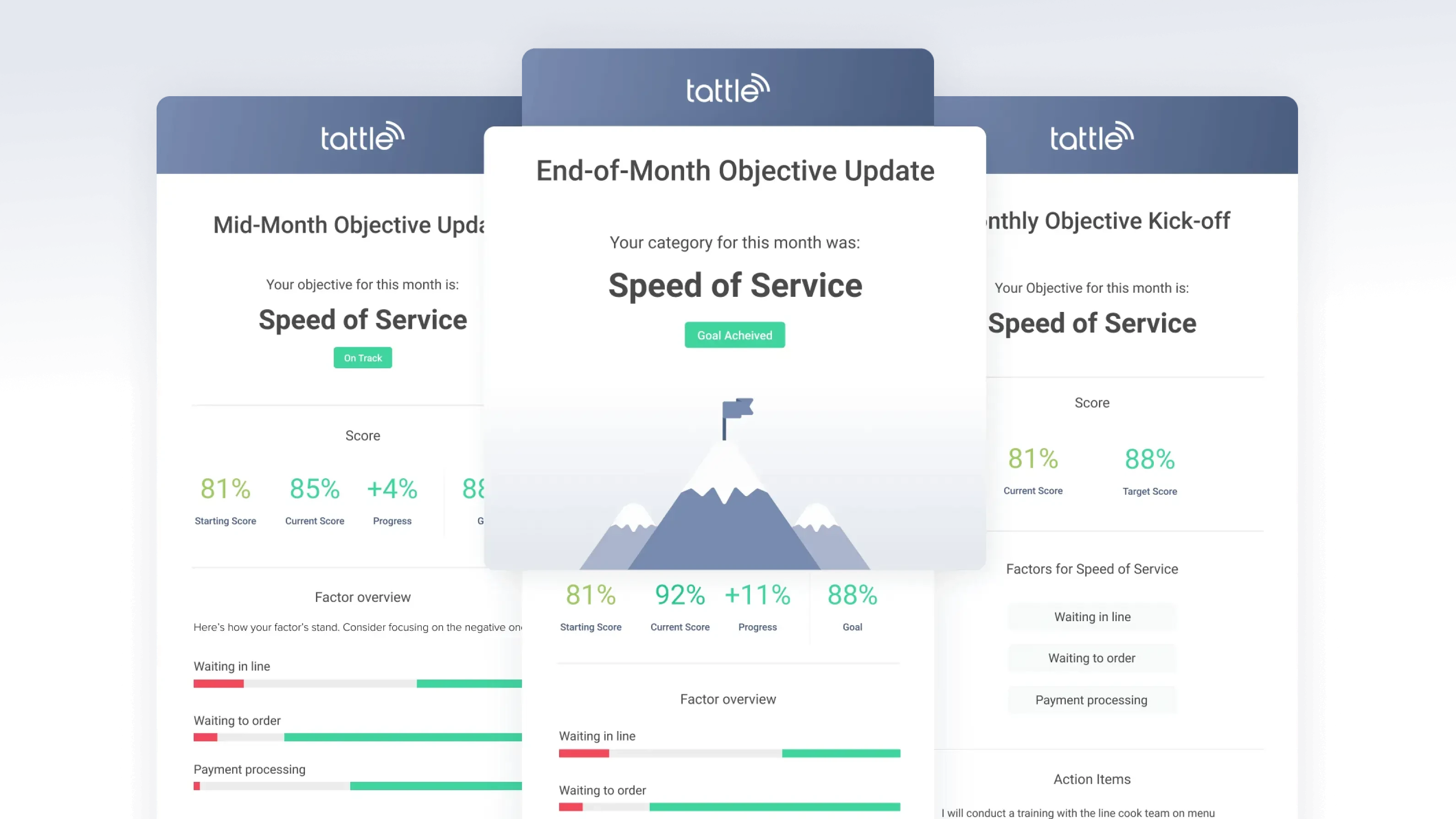
Emails.

Performance emails sent throughout the month clearly showcase user progress and alert users to areas of concern.

Emails

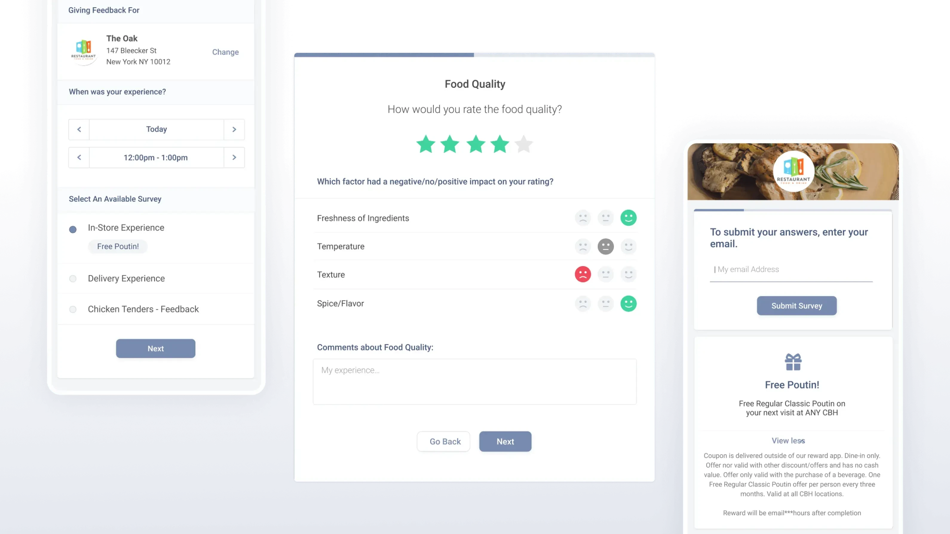
Feedback Collection.

In order to populate the dashboards with real-time data, Flatirons designed a mobile optimized survey to collect customer feedback directly after dining.

Feedback Collection

Custom Design System.

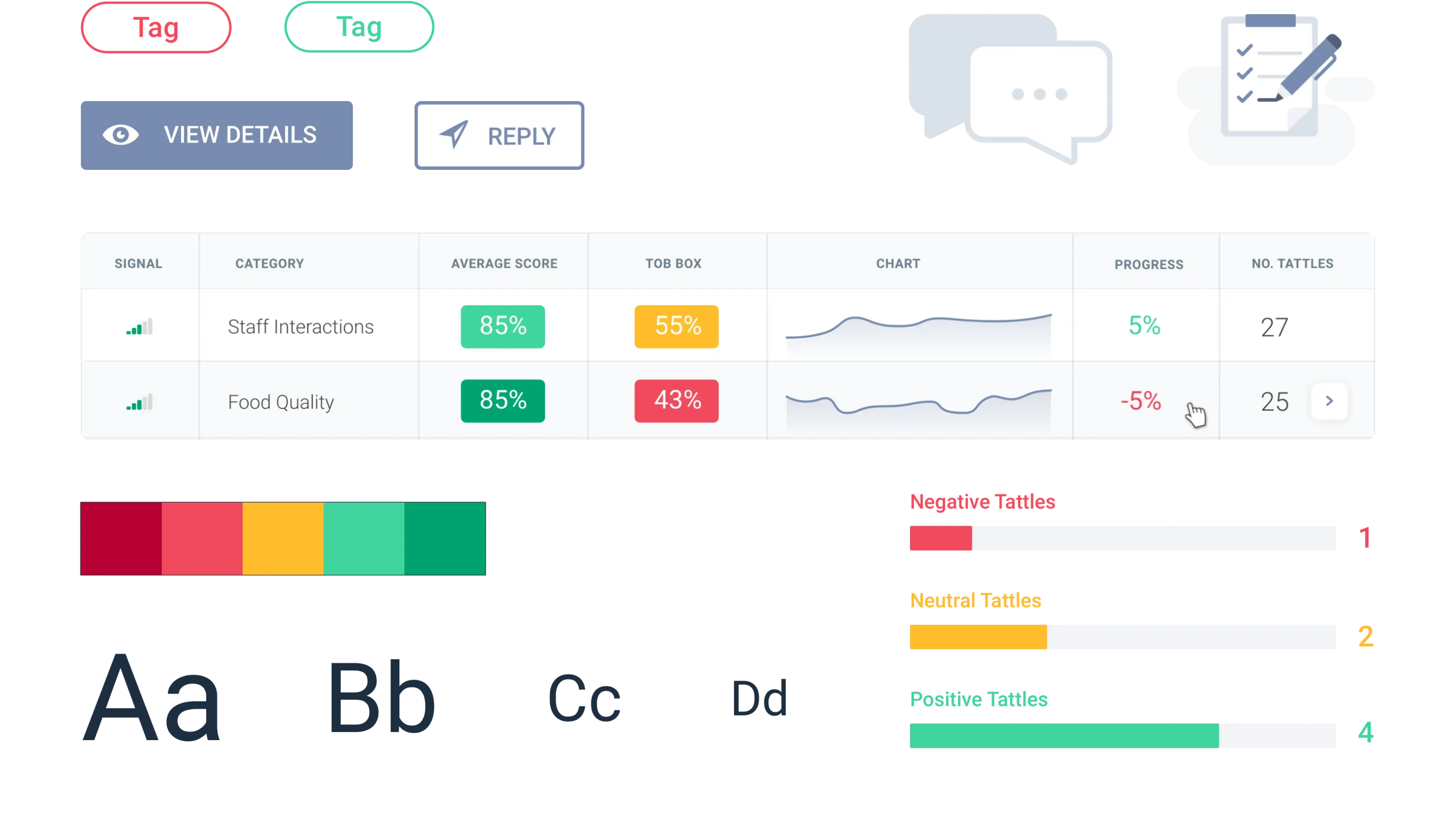
While designing new dashboards for the Snapshots feature, Flatirons created a living UI toolkit that can be expanded upon as Tattle applies the new look and feel of their dashboards to other areas across their site. The updated typography, colors, and form patterns are designed to simplify Tattle’s previously cluttered interface.

Custom Design System
Jeremy Zaborowski
With the help of Flatirons, we were able to launch a large update to our platform, introducing new innovative tools for our clients. The information was complex but Flatirons found creative ways to present it, making it feel simple and easy to understand.
Jeremy Zaborowski

Co-Founder & CTO

other projects

More of our work.

osmosis
osmosis

Transforming medical education

healthcare saas
view case study
jombine
jombine

A revolution in the hiring industry

human resources app b2/b2c
view case study
kindred box
kindred box

Leaving your loved ones prepared

end-of-life planning saas
view case study