Client case study

Transforming medical education.
HEALTHCARESAASB2B & B2C
Transforming medical education
Transforming medical education left
Transforming medical education right

The Goal

Osmosis is a software platform that empowers over one million students globally with a better understanding of medicine and health topics through fun, easy-to-digest videos and tools.

Osmosis and Flatirons have partnered together on a number of projects to enhance the app experience for both students and faculty. By helping refine their product strategy, we were able to increase user acquisition and lay the groundwork for sustained success.

What we did for
Osmosis.

Product Strategy

Product Strategy

User Research

User Research

Information Architecture

Information Architecture

User Experience Design

User Experience Design

User Interface Design

User Interface Design

Product Strategy.

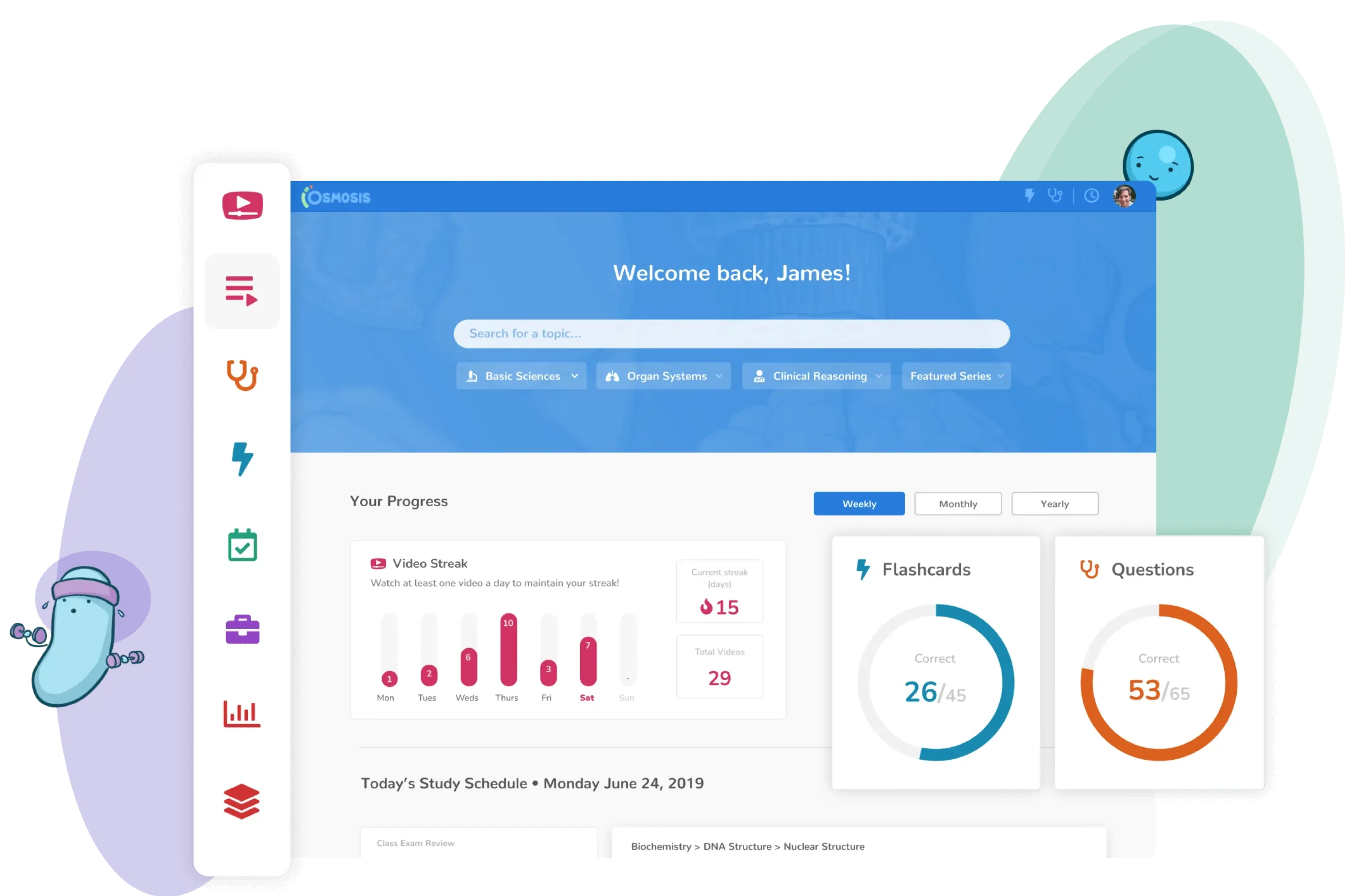
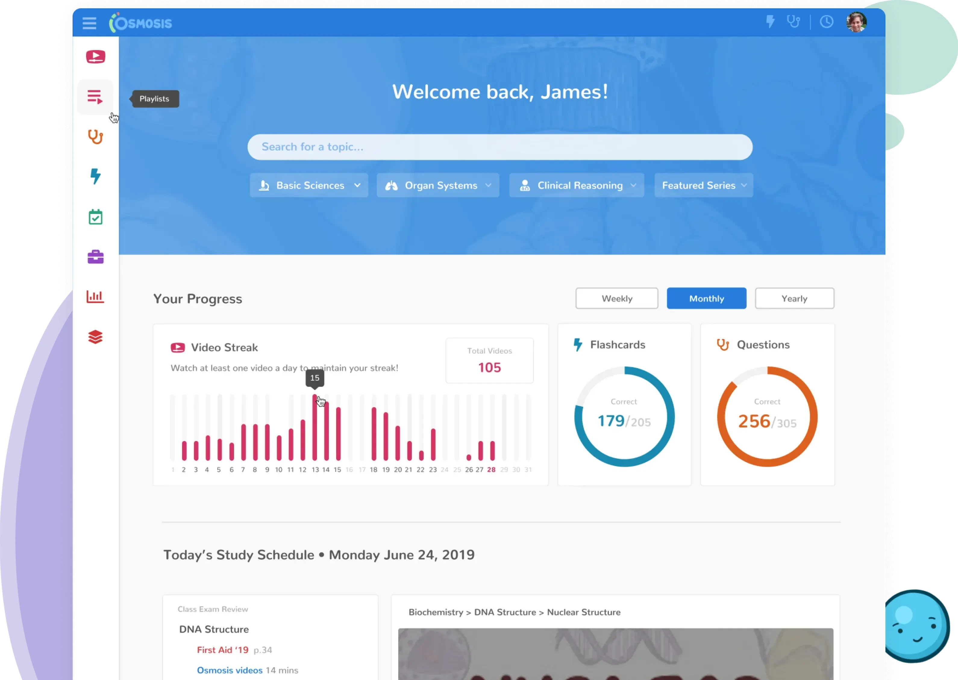
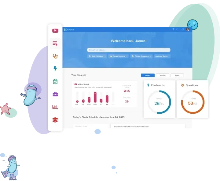
Students, Osmosis’ primary B2C user, were not getting value from their internal Osmosis dashboard and, therefore, were not engaging with it. In an effort to improve and personalize the student experience, Flatirons set out to redesign the dashboard.

Releasing the new student dashboard.

The video engagement metrics for students increased significantly after we released these design updates.
Osmosis dashboard

Information Architecture.

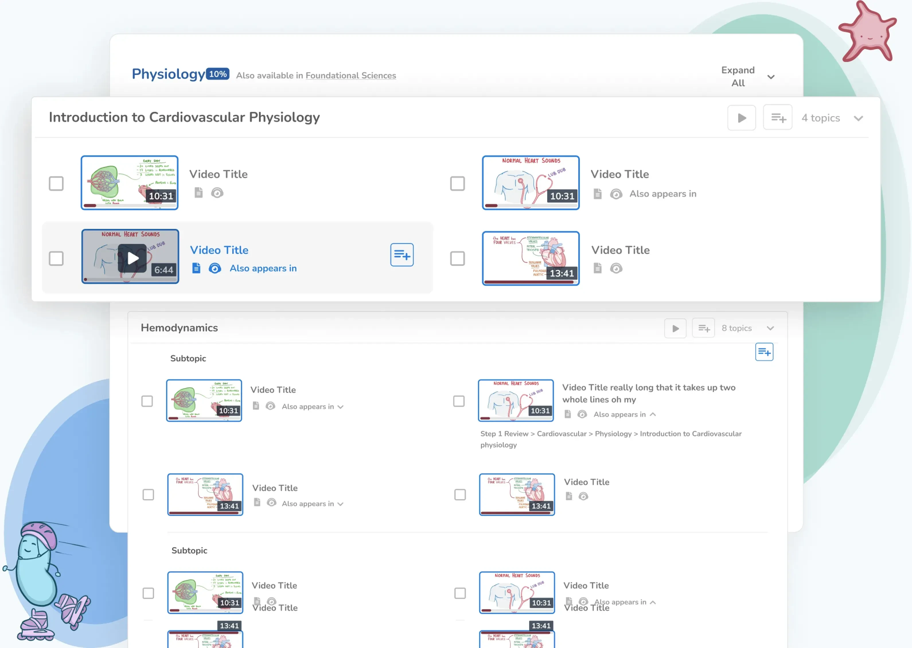
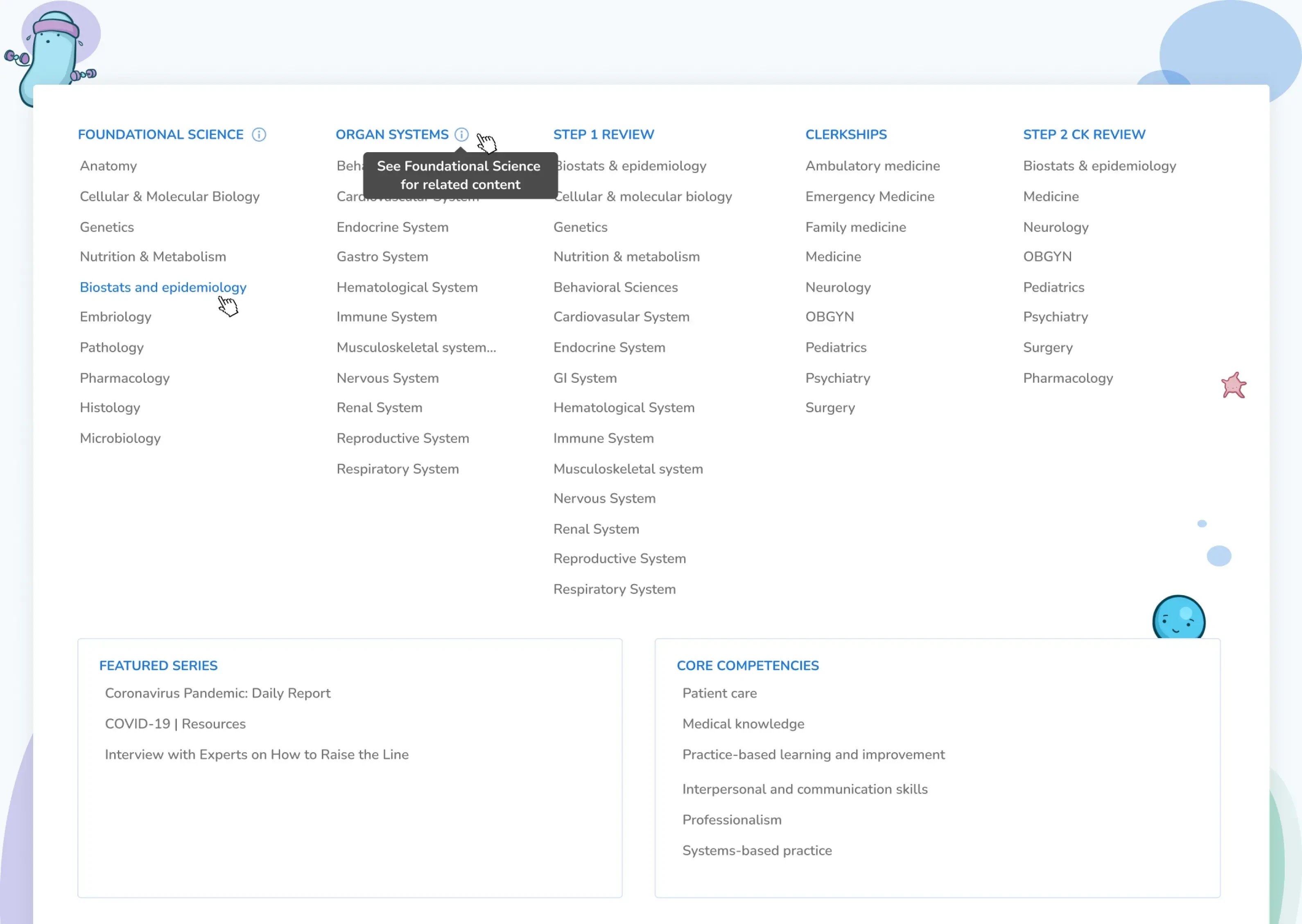
Osmosis houses over 1,600 videos on a very large variety of medical topics. In an effort to make their content more discoverable and user-friendly, Osmosis partnered with Flatirons to reimagine the content discovery experience across the platform.

Osmosis provided a content restructuring framework which Flatirons used to break down the existing components of the information architecture.

Cardiovascular Physiology
Information Architecture

User Research.

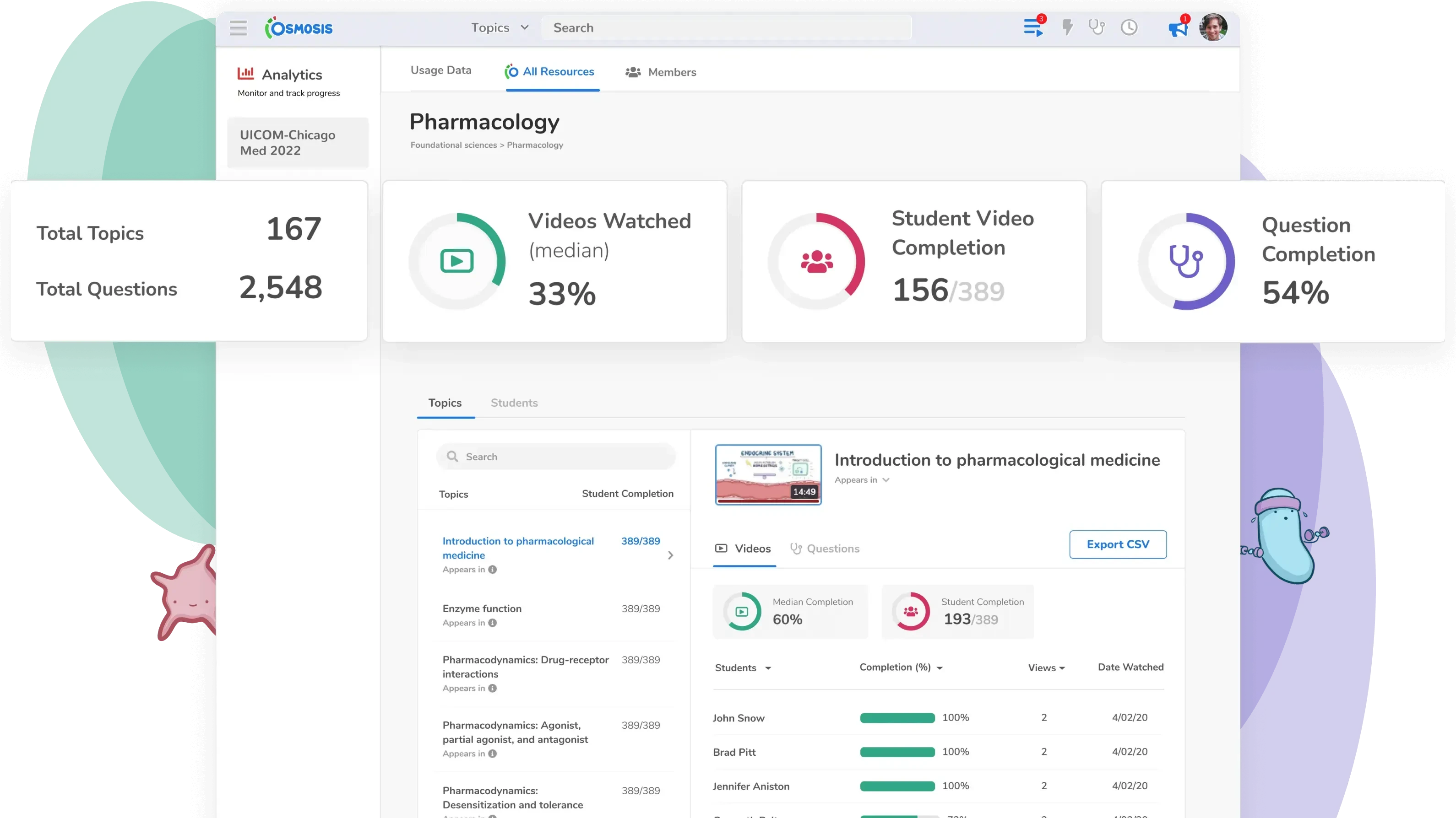
Faculty, Osmosis’ primary B2B user, needed deeper insights into how their students were engaging with content across the Osmosis platform and performing across varying topics so the faculty could identify students who were falling behind and understand how to help them. In an effort to expand the product capabilities for faculty and keep them loyal to the platform, Flatirons designed a more robust Analytics Dashboard that tracks student engagement and performance.

To understand how faculty were currently using the analytics dashboard, pain points, and desired improvements, we kicked off the discovery process with moderated user interviews. It became clear through our research that student engagement analytics would have the highest impact on user retention with student performance data as a close second. We additionally identified a number of other highly requested features that would improve the faculty experience and were able to prioritize their importance.

Based on our user research, we were able to design a new Student Analytics Dashboard that increased both faculty and student monthly active users.
Pharmacology Dashboard
Heidi Hildebrandt
Flatiron’s work optimized site design and flow. The creative lead at Flatirons demonstrated exceptional UX know-how, integrating usability and design to deliver a powerful product. The client came out of the engagement with a wider understanding of the most important platform features.
Heidi Hildebrandt

Director of Product

other projects

More of our work.

osmosis
osmosis

Transforming medical education

healthcare saas
view case study
jombine
jombine

A revolution in the hiring industry

human resources app b2/b2c
view case study
kindred box
kindred box

Leaving your loved ones prepared

end-of-life planning saas
view case study