SHARE
The Role of Muted Colors in Software Design


Contents
Contents
By 2028, the global UI market is projected to surpass $3.693 billion, with the UX market expected to reach $20.058 million. When it comes to software design, there is much more to consider than just functionality and usability. 75% of people surveyed admitted to assessing a company’s credibility through its website design. One often overlooked aspect is the role of colors in creating a seamless and engaging user experience. While vibrant and bold colors may initially catch the eye, have you ever wondered why muted colors are increasingly being used in software design? What is it about these subtle hues that make them such an essential tool in creating visually pleasing interfaces?
In this article, we will dive into the fascinating world of muted colors and explore their significance in software design. We will discuss the psychology behind using muted colors, the essentials of crafting a muted color palette for web development, best practices for implementing muted colors in UI/UX design, and the impact of these choices on user experience. So, are you ready to discover the power of muted colors in software design?
Key Takeaways:
- Muted hues create serene and elegant interfaces, improving user focus and interaction.
- Successful muted color schemes require a careful mix of pastels, darks, and lights for harmony and readability.
- Proper contrast and consideration for color blindness make interfaces more accessible and engaging for all users.
Introduction to Muted Colors
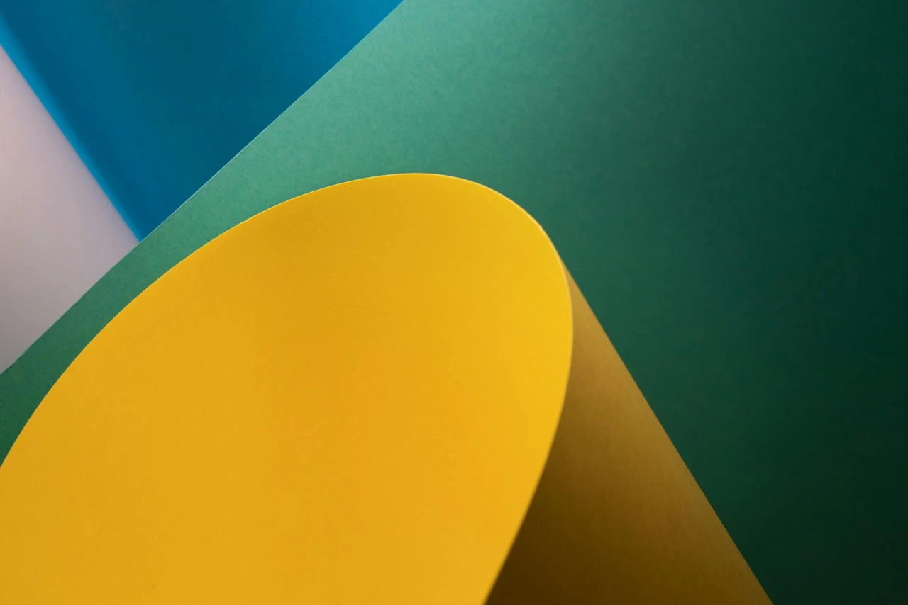
Muted colors have become a prominent choice in software design for their ability to add subtlety and sophistication to user interfaces. The selection of Pantone’s Colors of the Year, like “Serenity” and “Rose Quartz,” show the increasing preference for softer, more soothing colors.
By using softer and less vibrant hues, designers can create a visually appealing and calming experience for users. In this section, we will explore what muted colors are and delve into the psychology behind their use in design.
What Are Muted Colors?
Muted colors, also known as desaturated or subdued colors, are hues that have been toned down or desaturated by adding gray or mixing them with complementary colors. These colors are often less vibrant and have a lower saturation level compared to their more vivid counterparts. Muted colors can be achieved by modifying the brightness, saturation, or tone of a hue to create a muted or dulled effect.
The Psychology Behind Muted Colors
Understanding the psychology behind color is essential when it comes to creating effective designs. Muted colors evoke a sense of calmness, elegance, and sophistication. They can create a harmonious balance and provide a more relaxed experience for users. By using muted colors, UI/UX designers can create a visually appealing environment that encourages focus, clarity, and ease of use.
Crafting a Muted Color Palette for Web Development
Research indicates that within the first 90 seconds of viewing, people subconsciously form an opinion about a product, with color influencing 90% of this judgment. When it comes to web development, color plays a crucial role in creating a visually appealing and engaging user experience. While vibrant and bold colors have their place, have you ever considered the power of muted colors?
Imagine a website that exudes subtlety, elegance, and a touch of sophistication. Muted colors can accomplish just that and more. But what exactly are muted colors, and how can you craft a captivating muted color palette for your web development projects?
In this section, we will deep dive into the essentials of a muted color palette and explore different approaches for using muted colors in web development.
Essentials of a Muted Colors Palette
In order to create a visually pleasing and harmonious design, it is important to understand the essentials of a muted colors palette. Muted colors offer a soft and subtle approach to design, creating a sense of elegance and sophistication.
In this section, we will explore three different categories of muted colors and their applications in user interface design.
Muted Pastel Colors: A Soft Approach for User Interfaces
Muted pastel colors are known for their gentle and delicate nature. These colors are often used in user interfaces to create a soothing and calming effect on the user. Pastel colors can be effective in reducing visual fatigue and creating a sense of harmony in the interface. When using muted pastel colors, it is important to consider the contrast and readability of text and other elements to ensure a user-friendly experience.
Dark Muted Colors: Enhancing Accessibility and Contrast
Dark muted colors are ideal for creating a bold and dramatic effect in user interfaces. These colors provide a strong contrast and can be used to draw attention to important elements or create visual hierarchy. However, it is crucial to ensure that the contrast between the dark muted colors and other elements, such as text or icons, is sufficient for optimal accessibility. Using dark muted colors sparingly and in combination with lighter shades can help maintain balance and readability in the interface.
Light Muted Colors: Brightening Designs Subtly
Light muted colors are perfect for adding a subtle touch of brightness and warmth to designs. These colors are often used as background or accent colors to create a soft and inviting atmosphere. Light muted colors can also enhance the readability of text and improve overall visual comfort. Careful consideration should be given to the saturation and tonal value of light muted colors to ensure they do not overpower other design elements.
Implementing Muted Colors in UI/UX Design
When it comes to incorporating muted colors into UI/UX design, it is essential to follow best practices to achieve visually appealing and user-friendly interfaces.
How To Mute Colors
Muting colors can be achieved through various techniques. Whether it’s by reducing their saturation with the addition of gray or merging them with their complementary counterparts, the process, although detailed, is straightforward. This can be executed effectively using graphic design programs such as Adobe Photoshop or Illustrator. Playing around with different hues and shades can unveil distinct and appealing visuals.
Below are some methods to consider:
- Incorporate Gray: By integrating the color with different levels of gray, you can lessen its intensity. The greater amount of gray used, the more the color is toned down.
- Blend with Complementary Colors: Mixing the color with its complementary counterpart (found directly across on the color wheel) can produce a less saturated look, softening both colors.
- Introduce Tints: Lightening the color with white can generate a gentler, lighter variant. This approach is perfect for achieving pastel tones.
- Combine with Neutrals: Merging the color with neutral shades such as beige, taupe, or ivory can result in a subtler, more harmonious color scheme.
- Apply Transparent Overlays: Gradually muting the color can be accomplished by overlaying it with transparent layers of white or light gray.
- Adjust Saturation Levels: With digital design tools, modifying the saturation setting allows for the color’s vibrancy to be reduced effectively.
Tools and Resources for Color Palette Design
To create an effective muted color palette for UI/UX design, it is essential to use the right tools and resources. Here are some popular options:
- Adobe Color: This online tool allows you to experiment with different color combinations and create custom color schemes. It offers a wide range of predefined muted color palettes to inspire your designs.
- Coolors: Coolors is an intuitive color palette generator that provides a seamless experience for selecting and saving muted color schemes. It also offers the ability to export your palettes in various formats for easy integration into design projects.
- Color Hunt: Color Hunt is a curated collection of beautiful color palettes created by a community of designers. You can browse through a vast selection of muted color schemes and find inspiration for your UI/UX designs.
- Material Design Color Tool: Developed by Google, this tool allows you to create and customize color palettes based on Material Design principles. It offers options for creating muted color variations and provides valuable insights into accessibility and contrast considerations.
When using these tools, it’s important to consider factors such as accessibility, contrast, and the overall mood and tone you want to achieve in your design. Experiment with different combinations and variations to find the perfect muted color palette that aligns with your brand identity and enhances the user experience.
The Impact of Muted Colors on User Experience
When it comes to software design, every element counts. From layout and typography to navigation and functionality, every decision can impact the user experience. But have you ever wondered about the role of colors in this process? More specifically, what impact do muted colors have on the way users engage with software interfaces?
Accessibility Considerations with Muted Colors
When designing with muted colors, it is essential to consider the accessibility of your interface. Accessibility plays a crucial role in ensuring that your software is inclusive and can be used by a diverse range of users. Here are some key considerations when using muted colors:
- Color Contrast: Muted colors often have lower contrast compared to brighter, more saturated colors. It is important to ensure that there is sufficient contrast between text and background colors for readability. Conduct color contrast tests to ensure compliance with accessibility standards.
- Color Blindness: Take into account different types of color blindness when selecting muted colors. Some color combinations may be difficult for individuals with color vision deficiencies to distinguish. Individuals with colorblindness rely on luminance contrast. This type of contrast is present in all color palettes, varying from sharp or muted. The more muted the contrast, the harder it becomes for those with colorblindness to differentiate between colors. Consider using color blindness simulators or color accessibility tools to ensure your design is accessible to all users.
- Visual Hierarchy: Muted colors can still be used to create visual hierarchy and guide users’ attention. Utilize variations in shade, tint, and saturation to differentiate important elements from less important ones. This will help users easily understand the structure and content of your interface.
- Feedback and Interactivity: Ensure that muted colors are accompanied by clear visual feedback to indicate interactive elements or states. For example, use brighter or more saturated colors to highlight buttons or links when hovered over or clicked. This will enhance user engagement and improve the overall user experience.
By considering accessibility considerations when using muted colors, you can create user interfaces that are not only visually appealing but also inclusive and user-friendly for all individuals.
|
Accessibility Consideration |
Guidelines |
|
Color Contrast |
Ensure sufficient contrast between text and background colors for readability. |
|
Color Blindness |
Consider different types of color blindness and ensure color combinations are distinguishable. |
|
Visual Hierarchy |
Use variations in shade, tint, and saturation to create a visual hierarchy. |
|
Feedback and Interactivity |
Provide clear visual feedback for interactive elements using contrasting or saturated colors. |
Conclusion
As we have explored in depth, the role of muted colors in software design cannot be overstated. These subtle hues bring sophistication, calmness, and a unique aesthetic appeal to user interfaces, creating a harmonious and inviting digital environment.
Through careful consideration of psychology, accessibility, and visual appeal, muted colors can significantly enhance the user experience. They offer a soft yet impactful way to design interfaces that are not only visually appealing but also user-friendly and accessible.
The insights and best practices discussed provide a comprehensive guide for integrating muted colors into UI/UX design effectively. By embracing the subtle power of muted colors, designers can craft interfaces that resonate with users on a deeper level, encouraging engagement, clarity, and a positive interaction experience.
If you are looking for help implementing muted colors in your software design, read more about Flatirons’ UI/UX design services.
Frequently Asked Questions
What are muted colors?
Muted colors are colors that have been desaturated or toned down to create a softer and more subtle appearance. They have a lower saturation level and are often described as having a more faded or washed-out look compared to brighter, more vibrant colors.
What is the psychology behind using muted colors in design?
Muted colors are often associated with feelings of calmness, sophistication, and elegance. They create a sense of subtlety and can evoke a sense of nostalgia or vintage charm. Muted colors can also help reduce visual distractions and create a more focused and harmonious user experience.
How important is crafting a muted color palette for web development?
Crafting a muted color palette is crucial for creating aesthetically pleasing and user-friendly websites. A well-designed muted color palette can enhance the overall visual appeal of a website, create a cohesive and harmonious design, and improve user engagement and accessibility.
What are the essentials of a muted color palette?
The essentials of a muted color palette include selecting colors with low saturation, choosing colors that complement each other, and maintaining a consistent balance between light and dark shades. It is also important to consider the purpose and target audience of the website when selecting muted colors.
How can muted pastel colors be used in user interfaces?
Muted pastel colors can be used to create a soft and gentle aesthetic in user interfaces. They are often associated with a calming and soothing effect and can evoke feelings of relaxation or serenity. Muted pastel colors can be used as background colors, buttons, or for highlighting important elements.
UI/UX Design Services
UI/UX design services tailored for your unique needs.
Get the CEO's Take
Handpicked tech insights and trends from our CEO.
UI/UX Design Services
UI/UX design services tailored for your unique needs.
Get the CEO's Take
Handpicked tech insights and trends from our CEO.


Digital Product Development: Enhance Your Business Offerings
Flatirons Development
Sep 12, 2025

Utilizing Critical Incident Technique for Qualitative Research in UX Design
Flatirons Development
Aug 03, 2025
Light Mode vs Dark Mode: Which One is Better for You?
Flatirons Development
Jan 04, 2025

Top UI/UX Design Companies in California for 2026
Flatirons Development
Nov 30, 2024

Learn the Essentials of Digital Product Design
Flatirons Development
Nov 26, 2024

Top UI/UX Design Companies in Colorado for 2026
Flatirons Development
Nov 12, 2024Digital Product Development: Enhance Your Business Offerings
Flatirons Development
Sep 12, 2025Utilizing Critical Incident Technique for Qualitative Research in UX Design
Flatirons Development
Aug 03, 2025Light Mode vs Dark Mode: Which One is Better for You?
Flatirons Development
Jan 04, 2025Digital Product Development: Enhance Your Business Offerings
Flatirons Development
Sep 12, 2025Utilizing Critical Incident Technique for Qualitative Research in UX Design
Flatirons Development
Aug 03, 2025Light Mode vs Dark Mode: Which One is Better for You?
Flatirons Development
Jan 04, 2025Digital Product Development: Enhance Your Business Offerings
Flatirons Development
Sep 12, 2025Utilizing Critical Incident Technique for Qualitative Research in UX Design
Flatirons Development
Aug 03, 2025Light Mode vs Dark Mode: Which One is Better for You?
Flatirons Development
Jan 04, 2025
