SHARE
The Importance of Accessibility in UX/UI Design


Contents
Contents
When designing a new website, product, or service, one of the most important design considerations – and often the least considered – is accessibility. You can think of accessibility in UX/UI design as a scaffolding of design considerations used to ensure all users, independent of any impairment or background, can use the site seamlessly. Not all users have the same ability to view and interact with a website, so accessibility should be a top priority to ensure equal access and usage for all users.
There are three major categories for accessibility: the legal, the moral and the business considerations. Let’s take a look at these three categories to gain a better understanding of the drivers surrounding accessibility.
Legal
Today, accessibility in UX/UI design is being seen as a human right internationally. Over 250 different businesses have been sued in the US, including big cases like Target and Netflix, because they were not taking the proper design considerations to ensure accessibility for everyone.
Moral
Designing for accessibility should be done simply because it’s the right thing to do. As a business, it’s important to understand that you have a moral obligation to serve the entire community. This shows that your business is willing to go the extra mile to make your website accessible to all users.
Business
One aspect of accessibility in UX/UI design that many organizations don’t consider is the business consideration. By making one’s website more accessible, a company can effectively lower bounce rate, help search engine crawlers properly index images, and improve on-site engagement leading to higher SEO performance. This little shift of keeping website viewers engaged can actually result in better SEO results leading to more user interaction and higher conversion rates.
Who to Consider
When assessing accessibility design considerations, it’s important to understand who you are designing for.
There are four main disability types:
- Blindness (low vision and color blindness)
- Hearing
- Cognitive
- Motor/mobility impairments.
Based on accessibility content material from the Interaction Design Foundation, the first principle of accessibility for both web and mobile design is that blindness covers 80% of accessibility issues. So, while vision impairments may be the most common disability designers think about, it is important to remember those with hearing, cognitive, and motor/mobility impairments as well.
How to Know Your Website is Accessible
Luckily there are standards in place to help willful organizations ensure their website is accessible to all users. The standard most businesses follow is called the Web Content Accessibility Guidelines or WCAG for short. Here is the latest version, WCAG 2.1.
There are four principles of accessibility standards:
Perceivable
- Text Alternative
- Time-based Media
- Adaptable
- Distinguishable
Operable
- Keyboard Accessible
- Enough Time
- Seizure and Physical Reactions
- Navigable
- Input Modalities
Understandable
- Readable
- Predictable
- Input Assistance
Robust
- Compatible
As organizations look to meet the parameters set out in WCAG 2.1, there are levels of compliance or conformance that express how accessible one’s website is. You can use this WCAG testing tool to examine whether your website is accessible.
The three levels of compliance are:
A: This is the minimum level of accessibility.
AA: Everything in level A + additional requirements. This is what most companies aim for.
AAA: Everything in level A and AA + additional requirements.
Make Accessible Design Decisions
Here are some tips that will help you follow accessibility standards when designing your UI.
Add enough color contrast
One of the things you can do right away is to check your color contrast ratio, it’ll improve the readability of your product.
The level of compliance that most companies aim for is WCAG 2.1 Level AA; it requires a contrast ratio of 4.5:1 for normal text and 3:1 for large text (defined as 14 point and bold or larger, or 18 point or larger). Usually for graphics and user interface components, such as form input borders, requires at least 3:1 of contrast ratio.
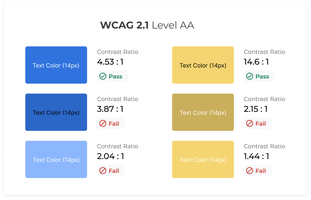
Here’s a quick overview of the contrast ratio required per level of compliance:
- A: Requires at least 3:1
- AA: Contrast ratio of at least 4.5:1 for normal text and 3:1 for large text
- AAA: Contrast ratio of at least 7:1 for normal text and 4.5:1 for large text
Tip: You can always check your hex codes to see how they measure up. Try this color contrast checker.
Don’t rely on color alone to convey information
Another consideration for those who might be colorblind is to always make sure that there are supporting icons or tooltips to describe the color differences you might be using in your designs.
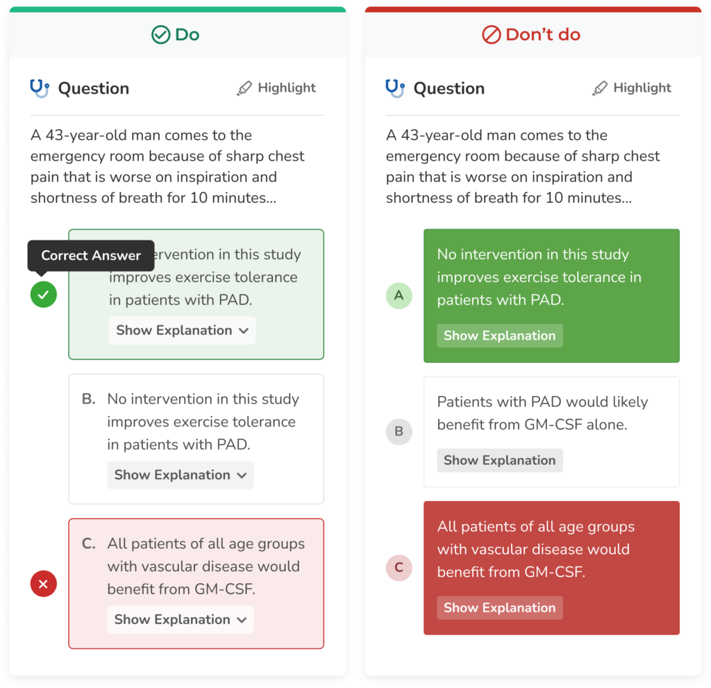
As you can see in this example, on the left, we are only communicating correct and incorrect answers with color (red = incorrect, green = correct). However, this would fail an accessibility test. On the right, we’ve adjusted the designs so that we are using icons (x = incorrect, checkmark = correct) to support the color difference, and we additionally have tooltips to further explain this UI. Color is now merely a supporting mechanism for communicating information to the user.
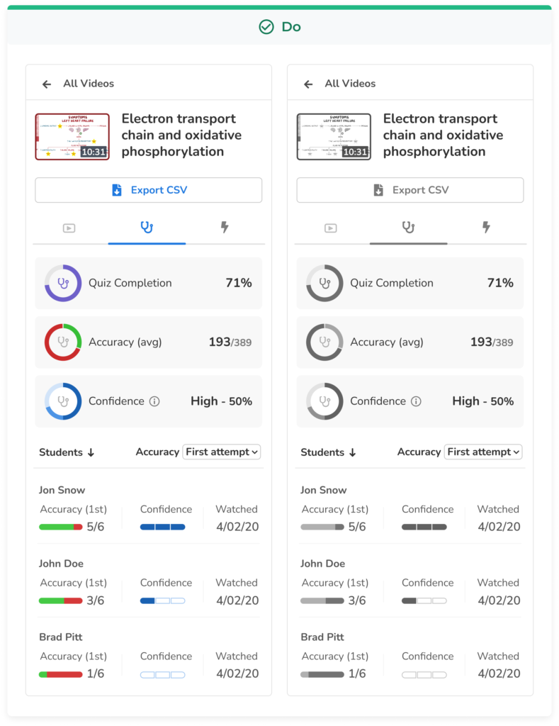
Check your designs in grayscale
All colors have their own saturation and brightness levels, and you might be working with hues that don’t have enough color contrast between them which can be an issue when working with things like data visualization. Therefore, it’s always good to ensure that your graphs are legible for those who are colorblind. One way to do that very easily is to double-check their brightness by converting your design to grayscale. That way you can see if two colors next to each other are indistinguishable by colorblind people.
Support Keyboard Navigation
To this point, keyboard accessibility is one of the most critical aspects of web accessibility. People with motor disabilities, low vision, those who don’t have precise muscle control, and even power users are dependent on a keyboard to navigate content.
So it’s recommended to design and implement focus states for all UI elements so that users know where they are in the interface when navigating with their keyboard.
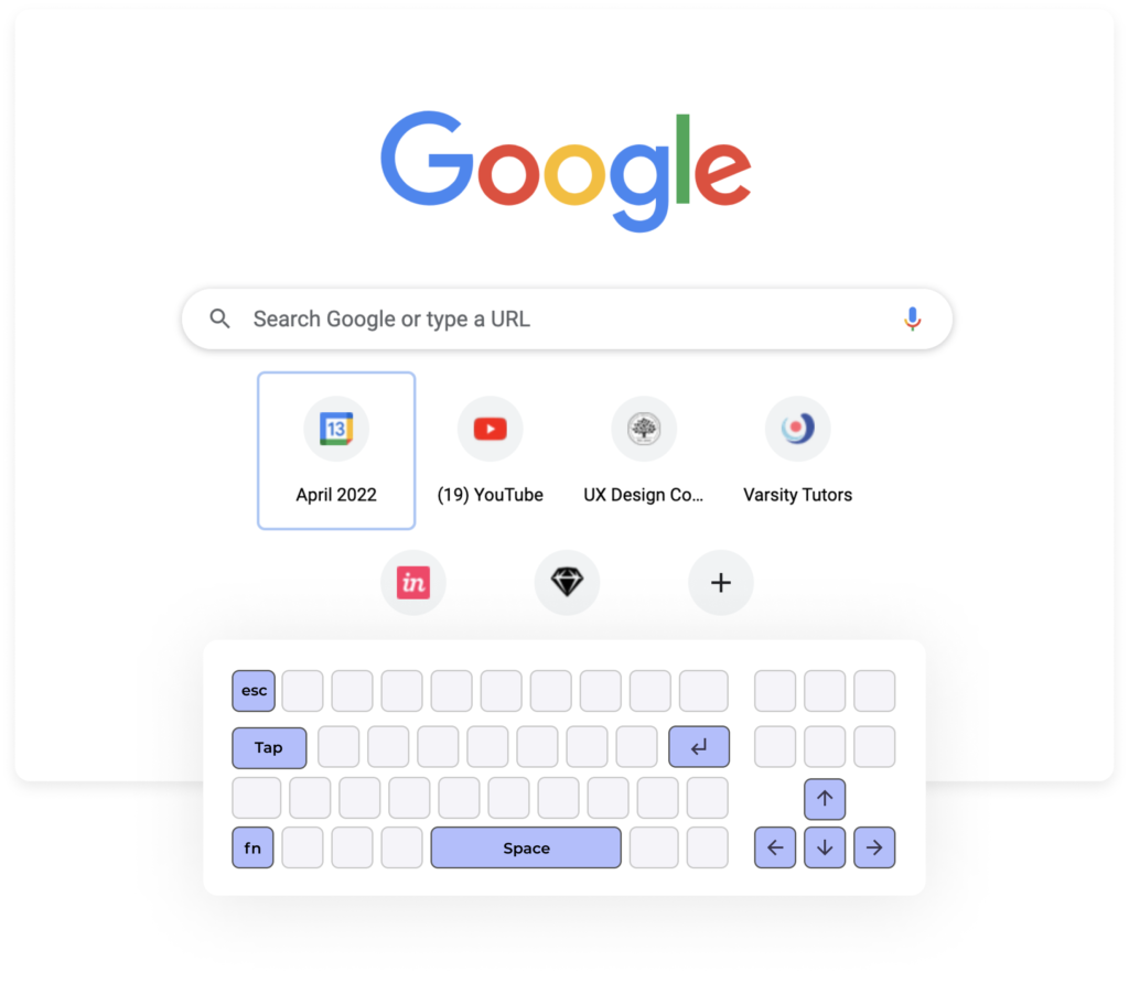
As seen by the likes of Google and Jira, many web-access platforms today are designed to favor intuitive keyboard navigation. This allows users of all backgrounds to be able to seamlessly use a website without the barriers seen in other more non-accessible websites.
Use labels and tags
One common mistake is not adding labels to form inputs and using placeholder text as the only source for proving instructions or guidance. Placeholder text usually has a low contrast ratio against the background, and it disappears when the user starts typing, making it hard for the user to check before submitting.
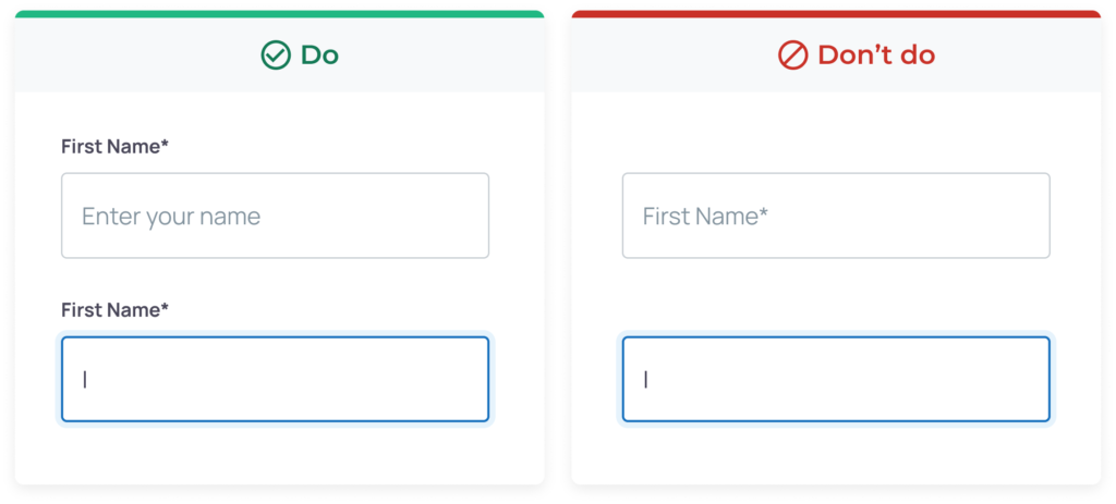
While placeholder text gives the user guidance or examples of what to write on text fields, screen readers cannot read back to the user placeholder text since they are not treated as labels, and without labels and the proper HTML code, users that depend on screen readers won’t know what the form text fields are for and won’t be able to properly navigate your product. Screen readers make for an important tool that allows those with visual impairments to understand the layout and options on a given website, so the use of labels and writing clean code are important practices to have.
If you want to understand more about how these assistive technologies work, here’s a quick demo of a screen reader used by a person with low vision: Screen Reader Demo for Digital Accessibility
Moving Forward with Accessibility in UX/UI Design
It’s critically important that organizations take the proper steps to approach the design of their website with everyone in mind to ensure inclusion, accessibility, and availability for anyone looking to view your website.
We hope this article gave you some ideas on how to approach your next website design, and some helpful considerations to ensure you’re promoting accessibility. Here at Flatirons Development in our design process, we ensure that all individuals are accounted for.
Reach out today to learn how we can ensure your next website or platform is intuitive, accessible, and user-friendly.
UI/UX Design Services
UI/UX design services tailored for your unique needs.
Get the CEO's Take
Handpicked tech insights and trends from our CEO.
UI/UX Design Services
UI/UX design services tailored for your unique needs.
Get the CEO's Take
Handpicked tech insights and trends from our CEO.


Light Mode vs Dark Mode: Which One is Better for You?
Flatirons
Jan 04, 2025

Top UI/UX Design Companies in California for 2025
Flatirons
Nov 30, 2024

Learn the Essentials of Digital Product Design
Flatirons
Nov 26, 2024

Top UI/UX Design Companies in Colorado for 2025
Flatirons
Nov 12, 2024
Top Mobile App Design Companies in Denver for 2025
Flatirons
Oct 11, 2024

Top Mobile App Design Companies in Colorado Springs for 2025
Flatirons
Oct 09, 2024
