SHARE
Light Mode vs Dark Mode: Which One is Better for You?
Contents
Contents
In this digital age, we spend countless hours staring at screens – be it our smartphones, tablets, or computers. With so much screen time, it’s important to consider how we can optimize our experience and protect our eyes. Does it really matter if you use light mode or dark mode on your devices?
The debate between light mode and dark mode has gained traction, with recent studies showing that 81.9% of smartphone users prefer dark mode. In this article, we will delve into the effects of light mode and dark mode on eye health, user experience, and battery life. By analyzing the results from studies on visual performance and reading comprehension, we will help you uncover the answer.
Key Takeaways:
- Light Mode offers better visual acuity and readability in well-lit environments.
- Dark Mode reduces eye strain and conserves battery life, especially on OLED/AMOLED screens.
- The choice between Light Mode and Dark Mode depends on environmental lighting and personal preferences.
- Providing both modes enhances user experience by catering to individual needs.
Understanding Light Mode vs Dark Mode
Light Mode and Dark Mode are two widely used display settings, each offering distinct advantages that cater to different user preferences and environmental conditions.
Light Mode
Light Mode is characterized by a bright background with dark text. This mode mimics the appearance of traditional paper and is generally preferred for its readability in well-lit environments.
The high contrast between the text and background in Light Mode ensures that content is easily visible, reducing the need for eye strain. Many users find this mode intuitive and familiar, making it a default choice for most applications and devices. However, prolonged use in dim environments can lead to discomfort due to the screen’s brightness.
Dark Mode
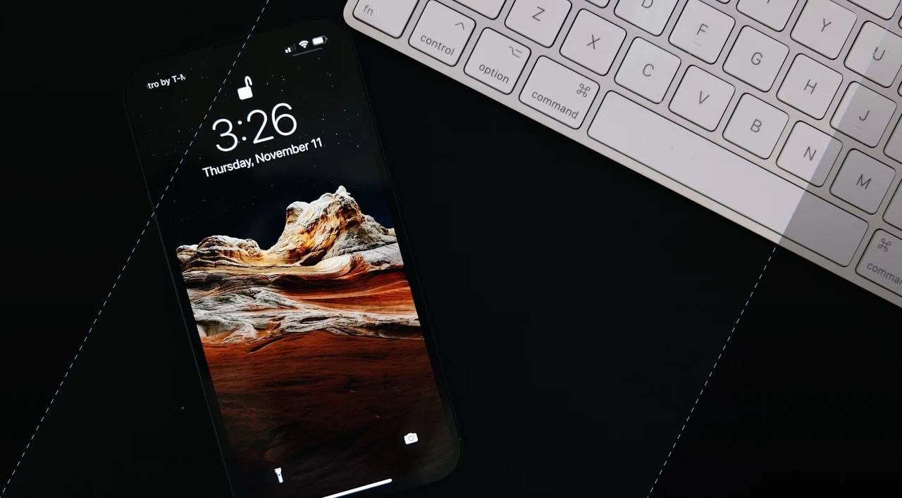
Dark Mode, in contrast, features a dark background with light text. This inversion of the typical color scheme reduces glare and is particularly beneficial in low-light or dark environments, such as at night or in dimly lit rooms.
By minimizing the amount of light emitted from the screen, Dark Mode can help reduce eye strain and fatigue, making it more comfortable for extended use.
Additionally, on devices with OLED or AMOLED screens, Dark Mode can conserve battery life, as these screen technologies consume less power when displaying darker colors. For example, studies have found that with AMOLED screens, dark mode can save 63% on battery life. Many users also find Dark Mode aesthetically pleasing and prefer it for its sleek, modern look.
Benefits and Considerations
The choice between Light Mode and Dark Mode ultimately depends on several factors:
- Environmental Lighting: Light Mode is optimal for bright settings, while Dark Mode is suited for low-light environments.
- Readability: Light Mode generally offers better readability due to the high contrast of dark text on a light background, but Dark Mode can be easier on the eyes for longer periods.
- Battery Life: Dark Mode can save battery life on OLED/AMOLED screens, making it a practical choice for mobile devices.
- User Preference: Personal comfort and aesthetic preferences play a significant role in choosing between the two modes.
UX Design Considerations
From a user experience (UX) design perspective, providing both Light Mode and Dark Mode options can significantly enhance user satisfaction. Allowing users to choose their preferred mode helps cater to individual needs and preferences, ensuring a more personalized and comfortable interaction with the application.
UX designers must consider factors such as color contrast, readability, and accessibility when designing for both modes to ensure a seamless experience regardless of the chosen setting.
Modern operating systems and applications often allow users to switch between Light Mode and Dark Mode easily, providing flexibility and personalization. 9.9% of Android users alternate between the light and dark settings. Some even offer automatic switching based on the time of day or ambient lighting conditions, enhancing user experience.
Effects of Contrast Polarity on Visual Acuity and Proofreading
When it comes to choosing between light mode and dark mode, it is essential to consider their effects on visual acuity and reading performance.
Visual acuity refers to the ability to see fine details and distinguish between similar objects or letters. Different contrast levels can significantly affect visual acuity, which in turn impacts reading comprehension and overall reading performance.
Light mode, with its positive contrast polarity, enhances the clarity and sharpness of text, increasing legibility and reducing the strain on your eyes. This can ultimately result in improved reading speed and accuracy.
Proofreading, a critical aspect of reading performance, is also influenced by contrast polarity. Dark mode, with its negative contrast, may cause words or letters to appear less distinct, making proofreading more challenging. On the other hand, light mode’s positive contrast can facilitate proofreading by making errors and inconsistencies more conspicuous.
Contrast Polarity and Older Adults
While light mode generally offers better visual acuity and reading performance, older adults may not experience the same level of benefits due to age-related changes in the eyes, such as decreased contrast sensitivity, which studies show on average begins between adults of 40-50 years of age.
The effects of contrast polarity on visual acuity and proofreading can vary among individuals based on visual characteristics, personal preferences, and ambient lighting. Therefore, it’s important to consider these factors when choosing the ideal contrast mode for your reading experience.
Effects of Contrast Polarity on Glanceable Reading
When it comes to the effects of contrast polarity on glanceable reading, which refers to quickly extracting information from displays in highly interruptible conditions, the choice between light mode and dark mode can make a difference. Positive contrast polarity, or light mode, is easier to read and more glanceable, especially in low light conditions.
Additionally, it’s important to consider the role of font size in glanceable reading. In web design, the average font size used is 16/18px, which strikes a balance between readability and aesthetic appeal. Smaller fonts were found to be easier to read in the light mode, further emphasizing the impact of contrast polarity on reading speed and comprehension.
An optimal glanceable reading experience should take into account the specific lighting conditions and font size on your device. Experimenting with different contrast polarities, typography, and font sizes can help you determine which mode provides the best readability and overall experience for your specific needs.
Advantages and Disadvantages of Dark Mode and Light Mode
Before making a decision between dark mode and light mode, it’s important to consider their respective advantages and disadvantages. Each mode offers unique features and considerations that can impact your overall experience.
|
Mode |
Advantages |
Disadvantages |
|
Dark Mode |
|
|
|
Light Mode |
|
|
Ultimately, the choice between dark mode and light mode depends on your personal preferences, specific usage scenarios, and the lighting conditions in which you frequently use your device. It is recommended to experiment with both modes and find the balance that works best for you.
Conclusion
The debate between Light Mode and Dark Mode centers on their effects on eye health, user experience, and battery life. Light Mode is optimal for bright settings and offers better readability, while Dark Mode reduces eye strain in low-light conditions and conserves battery life on OLED/AMOLED screens.
User preferences and specific usage scenarios play crucial roles in choosing between the two. By experimenting with both modes, users can determine which setting provides the best readability, comfort, and overall experience for their needs.
For more information on designing user-friendly and eye-healthy interfaces, check out Flatirons Development UI/UX Design Services.
FAQs
What is the difference between dark mode and light mode?
Dark mode features a dark background with light text, while light mode uses a light background with dark text.
Does dark mode reduce eye strain?
Dark mode can help reduce eye strain, especially in low-light conditions, as the dark background reduces the amount of light reaching the eyes.
Which mode is better for user experience (UX)?
Light mode generally offers better visual performance and reading comprehension in most situations, making it the preferred mode for optimal UX.
Does dark mode save battery life?
Dark mode can help conserve battery life on devices with OLED screens, as it requires less power to display dark pixels compared to light mode.
Can dark mode cause less light to reach the eyes?
Yes, dark mode reduces the amount of light entering the eyes, which can be beneficial in low-light environments or when using devices in a dark room.
Should I switch to dark mode if my surroundings are dark?
Yes, using dark mode in a dark environment can provide a more comfortable viewing experience by reducing the amount of bright light emitted by the screen.
Does dark mode reduce exposure to blue light?
Dark mode can help reduce exposure to blue light, as dark backgrounds emit less blue light compared to bright white backgrounds.
UI/UX Design Services
UI/UX design services tailored for your unique needs.
Get the CEO's Take
Handpicked tech insights and trends from our CEO.
UI/UX Design Services
UI/UX design services tailored for your unique needs.
Get the CEO's Take
Handpicked tech insights and trends from our CEO.

Digital Product Development: Enhance Your Business Offerings
Flatirons Development
Sep 12, 2025
Utilizing Critical Incident Technique for Qualitative Research in UX Design
Flatirons Development
Aug 03, 2025
Top UI/UX Design Companies in California for 2026
Flatirons Development
Nov 30, 2024
Learn the Essentials of Digital Product Design
Flatirons Development
Nov 26, 2024
Top UI/UX Design Companies in Colorado for 2026
Flatirons Development
Nov 12, 2024
Top Mobile App Design Companies in Denver for 2026
Flatirons Development
Oct 11, 2024
Digital Product Development: Enhance Your Business Offerings
Flatirons Development
Sep 12, 2025
Utilizing Critical Incident Technique for Qualitative Research in UX Design
Flatirons Development
Aug 03, 2025
Top UI/UX Design Companies in California for 2026
Flatirons Development
Nov 30, 2024
Digital Product Development: Enhance Your Business Offerings
Flatirons Development
Sep 12, 2025
Utilizing Critical Incident Technique for Qualitative Research in UX Design
Flatirons Development
Aug 03, 2025
Top UI/UX Design Companies in California for 2026
Flatirons Development
Nov 30, 2024
Digital Product Development: Enhance Your Business Offerings
Flatirons Development
Sep 12, 2025
Utilizing Critical Incident Technique for Qualitative Research in UX Design
Flatirons Development
Aug 03, 2025
Top UI/UX Design Companies in California for 2026
Flatirons Development
Nov 30, 2024