SHARE
Creating a Visual Design Language
Design is a form of communication. As designers, we use a broad range of individual elements to speak to our users, including colors, typography, shapes, icons, patterns, interactions, etc. With these elements, we speak to our audience, we tell a story. Visual design is a very sophisticated method of visual communication, going far beyond simply the look of a product. Just as writers use words to communicate with their readers, designers use design languages to communicate with their users.
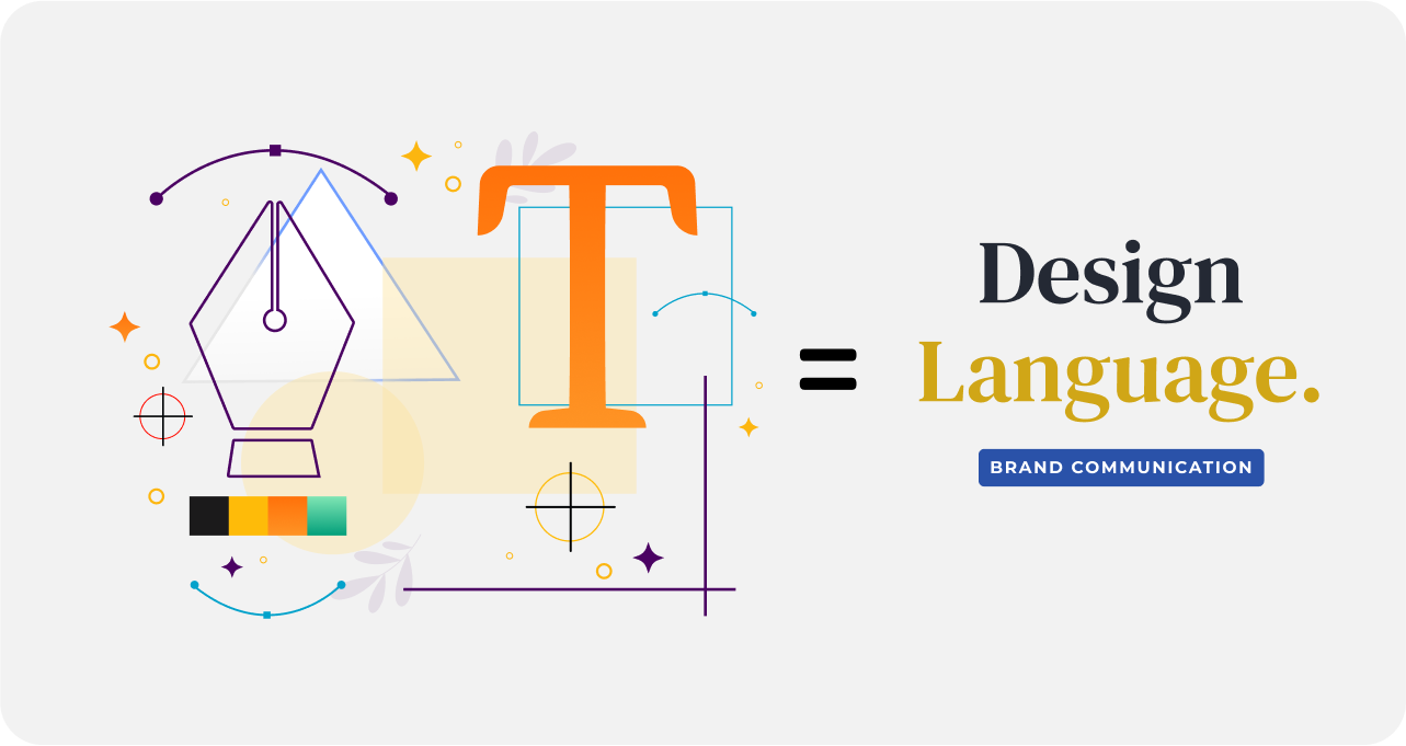
Visual Design Languages are a collection of concepts and elements that guide a brand’s visual identity. It is important to know the message you want to convey to users and how you want those users to comprehend the brand. By defining the visual design language, a project can move forward with clarity, cohesion, and speed. Being able to expand and communicate this message via design language in every part of a project is one of the strongest methods a designer can use for effective branding because it helps to make the design authentic. This authenticity makes a product stand out from the crowd. Unique visual design decisions create personality, character, and instant recognizability for the brand.
When users interact with a product that has a strong visual language, they tend to remember it better. Unfortunately, a majority of products available on the market have very generic designs, downloaded from libraries that do not represent the custom logos. It is too easy to confuse one product with another when they share the same visual styles. A design team’s primary goal should be to deliver a strong visual identity. This is the personality of a digital product, and it should be designed in a way that helps people remember the brand.
Steps to Create and Use a Visual Design Language System
Like all great things, a great visual design language does not happen by accident. It is the result of a thoughtful, carefully planned process. A visual design language must have a set of aesthetic and conceptual criteria in order to be cohesive. This also gives the team a set of reference points and coordinates to work with, making the design process more efficient and less confusing, promoting consistency in its designs. When you build a visual design language, you must establish a new ecosystem that defines solid design foundations to build a scalable design system.
1. Establish Visual Design Concepts
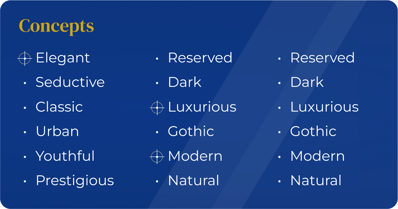
A design concept is a core idea driving the design of a product, guiding the design philosophy, and determining the design’s purpose. It is the foundation upon which you communicate your message. By defining the core concepts of your product, you can then translate those ideas into shapes, colors, typography, and other design elements. Later, when you make a poster or other marketing materials, you will have these core concepts in mind and design visuals that reflect your brand identity.
What are the core values and principles that your brand has? Often, these are simply the core adjectives you wish to associate with your brand. These adjectives become guideposts for your design process. For example, the design concepts of Airbnb are centered on “belonging, unified, iconic, controversial.” These concepts were used to develop an entirely new look for the company that visually represents the company’s values. It began with the Airbnb logo, an abstract mark named “Bélo”, that was designed as the visual representation of the concept of belonging and designed to be easily recognizable and reproducible. The dreamy blue and white colors were then added, to reflect emotions such as passion and love.
IBM’s values, on the other hand, attempt to establish the claim that they want to make designs that are “carefully thought, distinctively unified, masterfully executed, and positively advanced.”
Every design element proposed should be a subset of these core brand principles (design concepts). When working on visual language, it’s essential to have a clear understanding of who you’re designing for. Brand identity should match with the visual design language – aesthetic styles, tone of voice, iconography, and illustrations – all of these elements should speak in unison to your users about who you are.
2. Know your audience
Much like any commercial venture or artistic endeavor, knowing your audience is critical to the design process. Learning the needs, context, and history of your target audience will help ensure that you are communicating effectively. Designs often have a specific function for a specific segment of consumers, so one of the biggest mistakes a brand can make is to not adequately define their user persona/s. Who is your target audience? This user persona (or user personas) must be properly defined so that the design graphics speak directly to them.

3. Visual Design Language Competitive Research
There are very few entirely new ventures, and chances are, someone is doing something close or related to what you are doing already. To build a design language of your own, you need to understand the visual design language used by other similar ventures. Research these competitors and investigate how competitors have designed their sites.

A competitive analysis should provide key strategic insights. Are they successful? Are they missing anything, or do they have design solutions that might work for you? What are the key differentiators between your product/solution and theirs? By understanding competitors’ products, you can strategically design your solution with the goal of making a superior product and/or experience. If you do borrow any elements from competitor design, you must ensure you retain a unique Design DNA. The visual design language should be authentic and distinct from your major competitors, in order to stand out.
4. Visual Design Language Inspiration
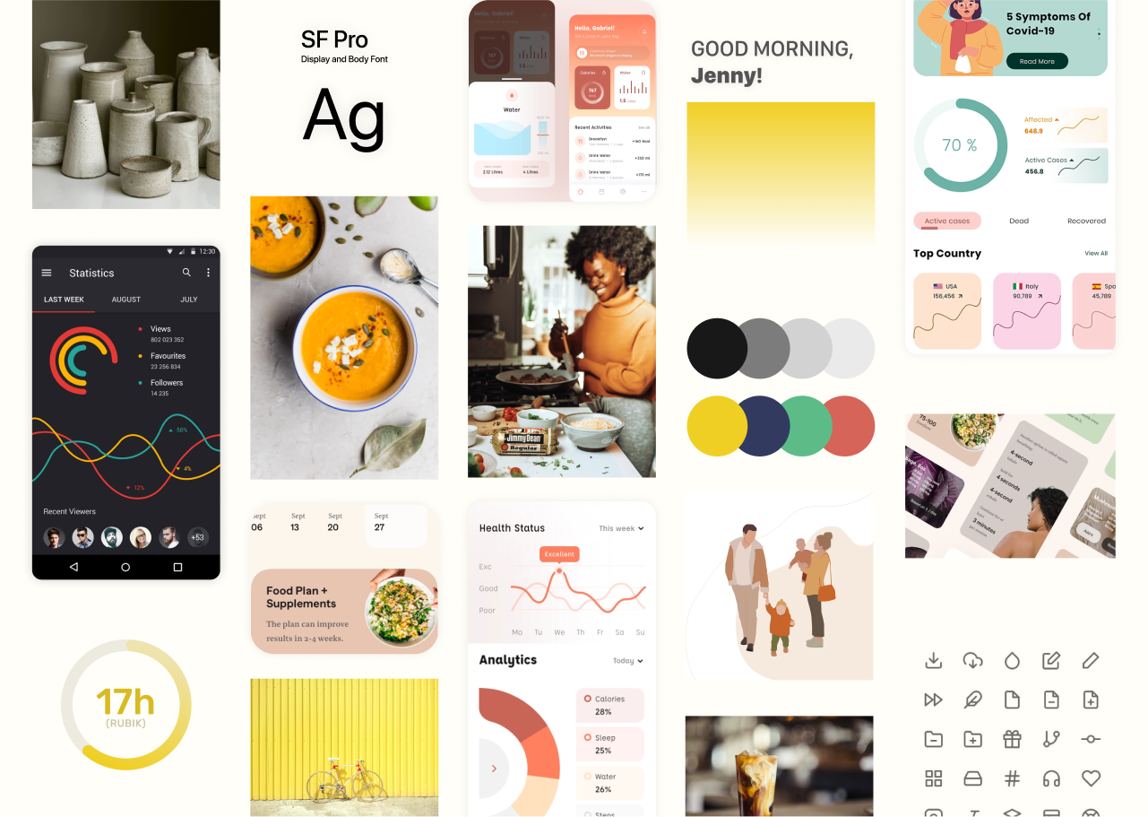
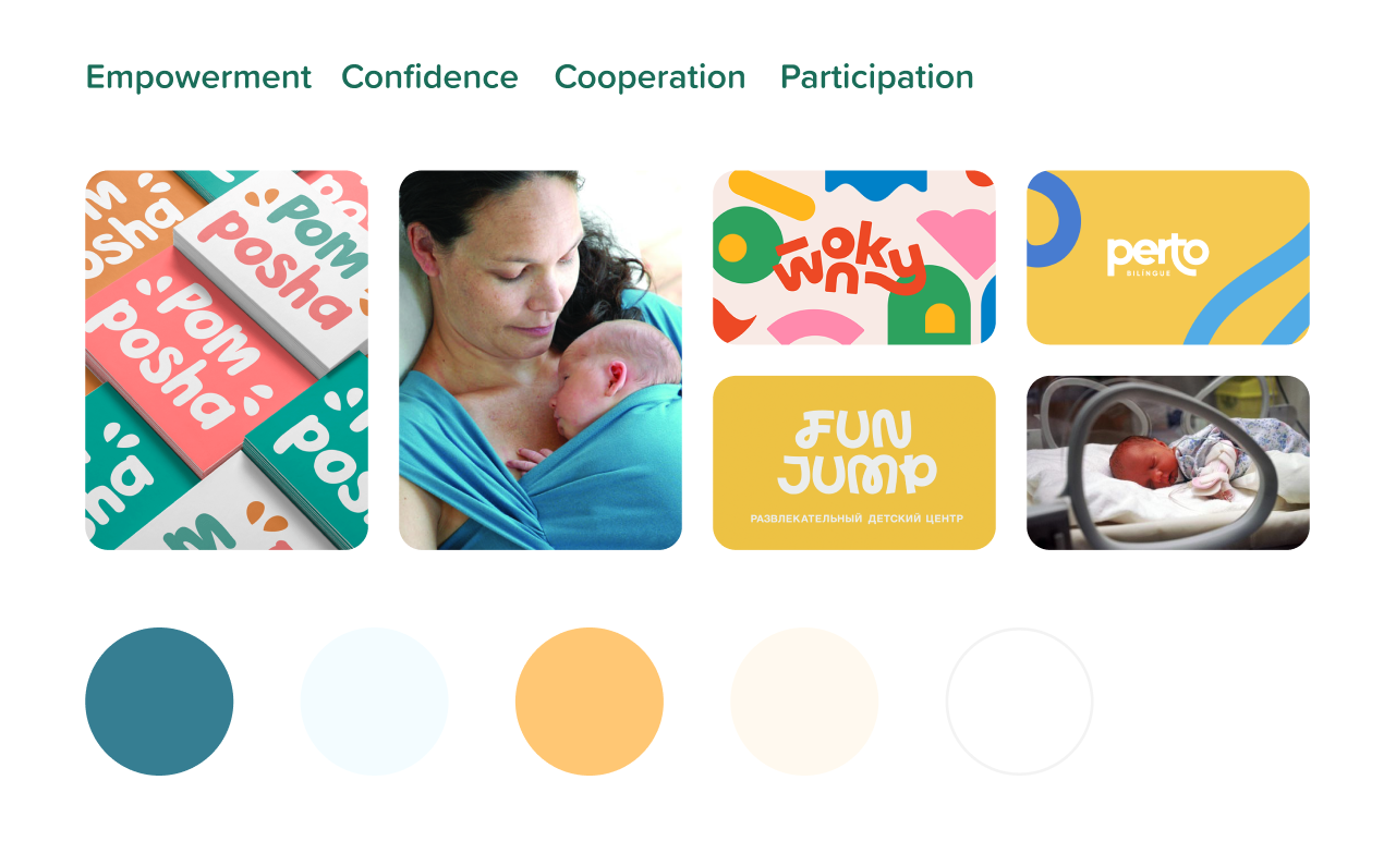
One of the most important aspects of creativity is an inspiration. To be inspired is to open our eyes to new possibilities. Inspiration can be stimulating, and positively affect the results of your work. By having inspirational references on hand, you can improve your creative potential. A good idea to visualize your inspiration is with a mood board, which is a visual representation of a concept design. The mood board is usually a collage of selected materials that represent the concepts we previously defined and gives us a general direction we want to take for the design. By putting these concepts and inspirations in one place, we can quickly and effectively start detecting patterns, colors, shapes, and other elements that have a common concept to communicate.
5. Visual Design Language Concept Development
Now that you understand what you want to communicate, have a concept defined, know who you are designing for, and are inspired, it’s time to start creating your design language. How can you translate these concepts into design elements? What typographies reflect and speak for your principles? Which font could you use if you want to communicate concepts like “Seductive”, “Elegant” or “Refined”? The same applies to colors, shapes, illustrations, icons, and all of the elements you will use to reflect your concepts. When you start combining these design elements, the ecosystem is brought to life. Each of these atoms is molecules, which then translates to organisms that are solid design foundations to build a scalable design ecosystem.
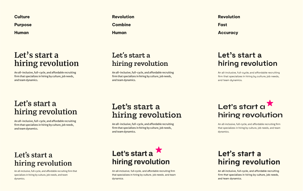
Having a Design Concept gives you the possibility to reflect it in design elements that can communicate in a scalable way. If you have a concept as your base, there is no need to repeat design elements over and over across your platform. For a concept such as the previously used example of “Seductive, Elegant, and Refined”, there are so many possible design elements that can be used to elicit that message. If instead your design language is based upon “Circles” or “Waves”, the bandwidth for the language is so narrow that it will run out of oxygen very quickly. This will result in the pages of your site becoming a monotonous repetition of the same element over and over again.
Summary
A great visual design language is built upon the core concepts and activities covered above and executing these with care and attention. Creating a new design language from scratch can be daunting but remember that a blank canvas should not be intimidating, but rather freeing. It is an opportunity to craft your message and communicate successfully, to enjoy the creative process which, if done well, can produce something truly special.
UI/UX Design Services
UI/UX design services tailored for your unique needs.
Get the CEO's Take
Handpicked tech insights and trends from our CEO.
UI/UX Design Services
UI/UX design services tailored for your unique needs.
Get the CEO's Take
Handpicked tech insights and trends from our CEO.

Digital Product Development: Enhance Your Business Offerings
Flatirons Development
Sep 12, 2025
Utilizing Critical Incident Technique for Qualitative Research in UX Design
Flatirons Development
Aug 03, 2025
Light Mode vs Dark Mode: Which One is Better for You?
Flatirons Development
Jan 04, 2025
Top UI/UX Design Companies in California for 2026
Flatirons Development
Nov 30, 2024
Learn the Essentials of Digital Product Design
Flatirons Development
Nov 26, 2024
Top UI/UX Design Companies in Colorado for 2026
Flatirons Development
Nov 12, 2024
Digital Product Development: Enhance Your Business Offerings
Flatirons Development
Sep 12, 2025
Utilizing Critical Incident Technique for Qualitative Research in UX Design
Flatirons Development
Aug 03, 2025
Light Mode vs Dark Mode: Which One is Better for You?
Flatirons Development
Jan 04, 2025
Digital Product Development: Enhance Your Business Offerings
Flatirons Development
Sep 12, 2025
Utilizing Critical Incident Technique for Qualitative Research in UX Design
Flatirons Development
Aug 03, 2025
Light Mode vs Dark Mode: Which One is Better for You?
Flatirons Development
Jan 04, 2025
Digital Product Development: Enhance Your Business Offerings
Flatirons Development
Sep 12, 2025
Utilizing Critical Incident Technique for Qualitative Research in UX Design
Flatirons Development
Aug 03, 2025
Light Mode vs Dark Mode: Which One is Better for You?
Flatirons Development
Jan 04, 2025